Deprecated: Creation of dynamic property WP_Term::$cat_ID is deprecated in /var/www/twodee/blog/wp-includes/category.php on line 378
Deprecated: Creation of dynamic property WP_Term::$category_count is deprecated in /var/www/twodee/blog/wp-includes/category.php on line 379
Deprecated: Creation of dynamic property WP_Term::$category_description is deprecated in /var/www/twodee/blog/wp-includes/category.php on line 380
Deprecated: Creation of dynamic property WP_Term::$cat_name is deprecated in /var/www/twodee/blog/wp-includes/category.php on line 381
Deprecated: Creation of dynamic property WP_Term::$category_nicename is deprecated in /var/www/twodee/blog/wp-includes/category.php on line 382
Deprecated: Creation of dynamic property WP_Term::$category_parent is deprecated in /var/www/twodee/blog/wp-includes/category.php on line 383
Deprecated: Creation of dynamic property WP_Term::$cat_ID is deprecated in /var/www/twodee/blog/wp-includes/category.php on line 378
Deprecated: Creation of dynamic property WP_Term::$category_count is deprecated in /var/www/twodee/blog/wp-includes/category.php on line 379
Deprecated: Creation of dynamic property WP_Term::$category_description is deprecated in /var/www/twodee/blog/wp-includes/category.php on line 380
Deprecated: Creation of dynamic property WP_Term::$cat_name is deprecated in /var/www/twodee/blog/wp-includes/category.php on line 381
Deprecated: Creation of dynamic property WP_Term::$category_nicename is deprecated in /var/www/twodee/blog/wp-includes/category.php on line 382
Deprecated: Creation of dynamic property WP_Term::$category_parent is deprecated in /var/www/twodee/blog/wp-includes/category.php on line 383
Deprecated: Creation of dynamic property WP_Term::$cat_ID is deprecated in /var/www/twodee/blog/wp-includes/category.php on line 378
Deprecated: Creation of dynamic property WP_Term::$category_count is deprecated in /var/www/twodee/blog/wp-includes/category.php on line 379
Deprecated: Creation of dynamic property WP_Term::$category_description is deprecated in /var/www/twodee/blog/wp-includes/category.php on line 380
Deprecated: Creation of dynamic property WP_Term::$cat_name is deprecated in /var/www/twodee/blog/wp-includes/category.php on line 381
Deprecated: Creation of dynamic property WP_Term::$category_nicename is deprecated in /var/www/twodee/blog/wp-includes/category.php on line 382
Deprecated: Creation of dynamic property WP_Term::$category_parent is deprecated in /var/www/twodee/blog/wp-includes/category.php on line 383
We could go with labels on the left and inputs on the right—with a grid to keep everything aligned. But the labels will have various lengths. Do we right-align them against the inputs, leaving a ragged axis on the left? Or do we left-align them, leaving internal space between the shortest labels and the inputs?
Or we could go with labels and inputs all in one vertical stack. The danger with this arrangement is ambigous visual parsing. Does a label associate with the input above it or below it?
I think neither approach is good. Both suffer from separateness. The label and input are distinct elements. Why not just put the label and the input in the same box? That’s easy enough to do in HTML.
<label class="infield">
  <span>Name</span>
  <input type="text">
</label>

<label class="infield">
  <span>Regrets</span>
  <input type="text">
</label>

<label class="infield">
  <span>Birth Order</span>
  <input type="text" class="number-input">
</label>
But these label-input pairs are very much separated when this HTML is rendered. We can hide this separateness with some CSS that visually blends the label, span, and input together. We strip out all of the input decorations and make the label look like one big box that we can type in. Really the label is just a vertical stack of its two children.
.infield {
  margin-top: 10px;
  display: flex;
  flex-direction: column;
  padding: 5px;
  border: 1px solid darkgray;
  border-radius: 3px;
  outline-width: 3px;
  outline-offset: -2px;
  background-color: #F6F6F6;
  box-shadow: inset 0 0 2px #999999;
}

.infield > span {
  color: darkgray;
  font-family: sans-serif;
  font-size: 12px;
  margin-bottom: 5px;
}

.infield > input {
  border: none;
  outline: none;
  background: none;
  font-size: 16px;
}
We end up with the form shown in Figure 1.
What about our outline? Usually the browser shows us what form element we are focused on. Well, if we have :focus-within, we can apply the outline to the surrounding label.
.infield:focus-within {
  outline-color: blue;
  outline-style: auto;
}

.infield:focus-within > span {
  font-weight: bold;
  color: blue;
}
The form shown in Figure 2 is more like what we are used to.
Perhaps we could highlight the fields when something has been entered, or when something has been entered incorrectly. Let’s add some styles for these two states.
.infield:focus-within > span, .infield.non-empty > span {
  color: blue;
  font-weight: bold;
}

.infield.error {
  outline-color: red;
  outline-style: auto;
  background-color: #FFEEEE;
}

.infield.error > span {
  color: red;
  font-weight: bold;
}
Some JavaScript is needed to dynamically add or remove these classes when the user types in the boxes.
const infields = document.querySelectorAll('.infield');
for (let infield of infields) {
  const input = infield.children[1];

  input.addEventListener('input', () => {
    infield.classList.toggle('non-empty', input.value.length > 0);
  });

  if (input.classList.contains('number-input')) {
    input.addEventListener('input', () => {
      infield.classList.toggle('error', input.value.length > 0 && !input.value.match(new RegExp('^\\d+$')));
    });
  }
}
There we have it! A form that is clearly labeled and easy to align. All that’s left is to put a really big Submit button below it, as we see in Figure 4.
Deprecated: Creation of dynamic property WP_Term::$cat_ID is deprecated in /var/www/twodee/blog/wp-includes/category.php on line 378
Deprecated: Creation of dynamic property WP_Term::$category_count is deprecated in /var/www/twodee/blog/wp-includes/category.php on line 379
Deprecated: Creation of dynamic property WP_Term::$category_description is deprecated in /var/www/twodee/blog/wp-includes/category.php on line 380
Deprecated: Creation of dynamic property WP_Term::$cat_name is deprecated in /var/www/twodee/blog/wp-includes/category.php on line 381
Deprecated: Creation of dynamic property WP_Term::$category_nicename is deprecated in /var/www/twodee/blog/wp-includes/category.php on line 382
Deprecated: Creation of dynamic property WP_Term::$category_parent is deprecated in /var/www/twodee/blog/wp-includes/category.php on line 383
Deprecated: Creation of dynamic property WP_Term::$cat_ID is deprecated in /var/www/twodee/blog/wp-includes/category.php on line 378
Deprecated: Creation of dynamic property WP_Term::$category_count is deprecated in /var/www/twodee/blog/wp-includes/category.php on line 379
Deprecated: Creation of dynamic property WP_Term::$category_description is deprecated in /var/www/twodee/blog/wp-includes/category.php on line 380
Deprecated: Creation of dynamic property WP_Term::$cat_name is deprecated in /var/www/twodee/blog/wp-includes/category.php on line 381
Deprecated: Creation of dynamic property WP_Term::$category_nicename is deprecated in /var/www/twodee/blog/wp-includes/category.php on line 382
Deprecated: Creation of dynamic property WP_Term::$category_parent is deprecated in /var/www/twodee/blog/wp-includes/category.php on line 383
Deprecated: Creation of dynamic property WP_Term::$cat_ID is deprecated in /var/www/twodee/blog/wp-includes/category.php on line 378
Deprecated: Creation of dynamic property WP_Term::$category_count is deprecated in /var/www/twodee/blog/wp-includes/category.php on line 379
Deprecated: Creation of dynamic property WP_Term::$category_description is deprecated in /var/www/twodee/blog/wp-includes/category.php on line 380
Deprecated: Creation of dynamic property WP_Term::$cat_name is deprecated in /var/www/twodee/blog/wp-includes/category.php on line 381
Deprecated: Creation of dynamic property WP_Term::$category_nicename is deprecated in /var/www/twodee/blog/wp-includes/category.php on line 382
Deprecated: Creation of dynamic property WP_Term::$category_parent is deprecated in /var/www/twodee/blog/wp-includes/category.php on line 383
- The content
- The
displayproperty - Everything else
The display property dictates how the content appears in relation to other content, and it silently cancels out other properties that don’t make sense for one its settings. I find understanding its behavior daunting, so I’m compiling a catalog of the differences between three common display settings: block, inline-block, and inline.
Here’s what I’ve come to understand so far:
| property | block | inline-block | inline |
|---|---|---|---|
width
|
defaults to fill parent | defaults to fit content | fits content |
height
|
defaults to fit content | defaults to fit content | fits content |
margin
|
all directions can be set | all directions can be set |
only -left and -right can be set
|
padding
|
all directions can be set | all directions can be set |
-left and -right affect flow, -top and -bottom bleed
|
transform
|
supported | supported | not supported |
| flow | surrounded by linebreaks | surrounded by linebreaks only if it overflows parent’s width | not surrounded by linebreaks |
| overflow | if height is fixed, content bleeds | if height is fixed, content bleeds | content wraps into next line of flow |
| wrapping between elements | mandatory, as blocks do not appear on the same line | elements in sequence do not bind to each other; if sequence overflows parent, breaks appear between elements | elements in sequence and not separated by whitespace bind to each other; if sequence overflows parent, breaks only appear at whitespace |
I’m including a little sample for experimenting with these settings. The blue square below is by default set to display as a block. Inspect the element and change its properties to see how they are influenced by display.
Lorem ipsum dolor sit amet, consectetur adipiscing elit. Mauris a dapibus purus. Donec ut purus at massa mattis porta. Nam varius eget mi sit amet maximus. Right-click on me, click Inspect, and change my properties. Fusce porta neque eu lacus dapibus dignissim. Aliquam sed sem nisl. Quisque bibendum posuere eleifend. Nulla ultricies tristique massa id vestibulum. Sed feugiat eros sit amet leo malesuada condimentum. Sed eleifend tortor augue.
]]>Deprecated: Creation of dynamic property WP_Term::$cat_ID is deprecated in /var/www/twodee/blog/wp-includes/category.php on line 378
Deprecated: Creation of dynamic property WP_Term::$category_count is deprecated in /var/www/twodee/blog/wp-includes/category.php on line 379
Deprecated: Creation of dynamic property WP_Term::$category_description is deprecated in /var/www/twodee/blog/wp-includes/category.php on line 380
Deprecated: Creation of dynamic property WP_Term::$cat_name is deprecated in /var/www/twodee/blog/wp-includes/category.php on line 381
Deprecated: Creation of dynamic property WP_Term::$category_nicename is deprecated in /var/www/twodee/blog/wp-includes/category.php on line 382
Deprecated: Creation of dynamic property WP_Term::$category_parent is deprecated in /var/www/twodee/blog/wp-includes/category.php on line 383
Deprecated: Creation of dynamic property WP_Term::$cat_ID is deprecated in /var/www/twodee/blog/wp-includes/category.php on line 378
Deprecated: Creation of dynamic property WP_Term::$category_count is deprecated in /var/www/twodee/blog/wp-includes/category.php on line 379
Deprecated: Creation of dynamic property WP_Term::$category_description is deprecated in /var/www/twodee/blog/wp-includes/category.php on line 380
Deprecated: Creation of dynamic property WP_Term::$cat_name is deprecated in /var/www/twodee/blog/wp-includes/category.php on line 381
Deprecated: Creation of dynamic property WP_Term::$category_nicename is deprecated in /var/www/twodee/blog/wp-includes/category.php on line 382
Deprecated: Creation of dynamic property WP_Term::$category_parent is deprecated in /var/www/twodee/blog/wp-includes/category.php on line 383
Deprecated: Creation of dynamic property WP_Term::$cat_ID is deprecated in /var/www/twodee/blog/wp-includes/category.php on line 378
Deprecated: Creation of dynamic property WP_Term::$category_count is deprecated in /var/www/twodee/blog/wp-includes/category.php on line 379
Deprecated: Creation of dynamic property WP_Term::$category_description is deprecated in /var/www/twodee/blog/wp-includes/category.php on line 380
Deprecated: Creation of dynamic property WP_Term::$cat_name is deprecated in /var/www/twodee/blog/wp-includes/category.php on line 381
Deprecated: Creation of dynamic property WP_Term::$category_nicename is deprecated in /var/www/twodee/blog/wp-includes/category.php on line 382
Deprecated: Creation of dynamic property WP_Term::$category_parent is deprecated in /var/www/twodee/blog/wp-includes/category.php on line 383
https://nam03.safelinks.protection.outlook.com/?url=https%3A%2F%2Fwww.vocareum.com&data=02%7C01%7Cfoobag%40uwec.edu%7C372342a6fa3b4f1adab108d748d9342f%7Cdd068b97759349388b3214faef2af1d8%7C0%7C0%7C637057970042004514&sdata=jYmiTB4vWrZY6P16O4NoYMdw0HpV8vgDM5BYKTc66%2FE%3D&reserved=0

Cloud computing is disrupting all aspects of educational infrastructure.

Learning Labs are no exception.

If you are looking to upgrade your student or research lab infrastructure, please consider Vocareum Campus Cloud https://nam03.safelinks.protection.outlook.com/?url=https%3A%2F%2Fwww.vocareum.com%2Fcampus&data=02%7C01%7Cfoobag%40uwec.edu%7C372342a6fa3b4f1adab108d748d9342f%7Cdd068b97759349388b3214faef2af1d8%7C0%7C0%7C637057970042004514&sdata=lz93Q3wU0csfDM2IFPHdT5S1TkL4%2BuBTh%2FSVwisyh%2B8%3D&reserved=0.

Just as cloud storage dramatically improves the efficiency of saving and sharing content, we believe the next natural step includes “virtual labs” that combine compute with storage and accelerate learning and collaboration among all stakeholders in educational contexts -  instructors, graders, learners, researchers and administrators.

Vocareum Campus Cloud provides university IT departments with a valuable tool to deploy and manage cloud resources. The use cases range from providing windows based applications to learners, supporting HPC computing needs, or helping research groups manage cloud computing resources as a part of a research grant

We can deliver these labs at scale, securely and at low cost -- hundreds of thousands of learners are on our platform at any given time.

LEARN MORE https://nam03.safelinks.protection.outlook.com/?url=https%3A%2F%2Fwww.vocareum.com%2Fcampus&data=02%7C01%7Cfoobag%40uwec.edu%7C372342a6fa3b4f1adab108d748d9342f%7Cdd068b97759349388b3214faef2af1d8%7C0%7C0%7C637057970042004514&sdata=lz93Q3wU0csfDM2IFPHdT5S1TkL4%2BuBTh%2FSVwisyh%2B8%3D&reserved=0

Vocareum Campus Cloud is built on a diverse cloud infrastructure to support exactly what you need at the right price point. Following are some of the lab infrastructures we support -

A single container or a network of containers
	A network of virtual machines
	Shared virtual machines isolated by user account
	Budgeted credentials for AWS cloud

Some of the features of our labs are  -

Integration to popular Learning Management Systems
	Integration to online proctoring systems
	Ability for instructors to view student’s work live and provide feedback
	Use pre-built images from Vocareum or upload your own
	Secure license management infrastructure to deliver commercial software
	Automated assessment

REQUEST INFO https://nam03.safelinks.protection.outlook.com/?url=https%3A%2F%2Fwww.vocareum.com%2F%23contact&data=02%7C01%7Cfoobag%40uwec.edu%7C372342a6fa3b4f1adab108d748d9342f%7Cdd068b97759349388b3214faef2af1d8%7C0%7C0%7C637057970042004514&sdata=LYU5pf4WpFP0SdZdRcAnwSg1m99nQV%2Fum3dfHDnAOU4%3D&reserved=0

UPCOMING EVENTS:

Please join us at Educause https://nam03.safelinks.protection.outlook.com/?url=https%3A%2F%2Fevents.educause.edu%2Fannual-conference&data=02%7C01%7Cfoobag%40uwec.edu%7C372342a6fa3b4f1adab108d748d9342f%7Cdd068b97759349388b3214faef2af1d8%7C0%7C0%7C637057970042004514&sdata=hRTJo8IyG8FGm4j1eVpY9DZum8m2gojsSZCtp5NIrl0%3D&reserved=0 (Chicago, October 14-17) and DevLearn https://nam03.safelinks.protection.outlook.com/?url=https%3A%2F%2Fwww.elearningguild.com%2Fdevlearn%2Fcontent%2F5800%2Fdevlearn-2019-conference--expo--home%2F&data=02%7C01%7Cfoobag%40uwec.edu%7C372342a6fa3b4f1adab108d748d9342f%7Cdd068b97759349388b3214faef2af1d8%7C0%7C0%7C637057970042004514&sdata=raHxrQ45wiq8jEH68%2F8Kn0yP99EHHeexq7w%2BTfL3T88%3D&reserved=0 (Las Vegas, October 23-25) to learn about the most innovative and revolutionary new strategies for scaling campus and online learning labs!

Vocareum

2025 Gateway Place, Suite 205

San Jose, CA 95110
The original URLs are no longer intelligible; they are HTML-encoded and sent as parameters to the safelinks service. The result is that users of this service are less informed and more reliant on automation. Additionally, my email address is sent to the service. I see no reason why Microsoft needs my identity.
I really don’t like this feature.
Thankfully, I use an email client that lets me apply filters to messages before showing them. I wrote this short preprocessor that replaces the safelink URLs with the original URLs decoded:
#!/usr/bin/env ruby
require 'uri'
safe = STDIN.read
# Match all URL characters except not terminal periods...
unsafe = safe.gsub(%r{https://nam03\.safelinks\.protection\.outlook\.com/\?url=(.*?)&[a-zA-Z0-9.%=&;]*(?<!\.)}) do |url|
URI.unescape($1)
end
puts unsafe
In my Mutt configuration file, I set this filter to be applied to all messages:
set display_filter = "$HOME/bin/unsafelinks"
Now the message above looks like this:
https://www.vocareum.com

Cloud computing is disrupting all aspects of educational infrastructure.

Learning Labs are no exception.

If you are looking to upgrade your student or research lab infrastructure, please consider Vocareum Campus Cloud https://www.vocareum.com/campus.

Just as cloud storage dramatically improves the efficiency of saving and sharing content, we believe the next natural step includes “virtual labs” that combine compute with storage and accelerate learning and collaboration among all stakeholders in educational contexts -  instructors, graders, learners, researchers and administrators.

Vocareum Campus Cloud provides university IT departments with a valuable tool to deploy and manage cloud resources. The use cases range from providing windows based applications to learners, supporting HPC computing needs, or helping research groups manage cloud computing resources as a part of a research grant

We can deliver these labs at scale, securely and at low cost -- hundreds of thousands of learners are on our platform at any given time.

LEARN MORE https://www.vocareum.com/campus

Vocareum Campus Cloud is built on a diverse cloud infrastructure to support exactly what you need at the right price point. Following are some of the lab infrastructures we support -

A single container or a network of containers
	A network of virtual machines
	Shared virtual machines isolated by user account
	Budgeted credentials for AWS cloud

Some of the features of our labs are  -

Integration to popular Learning Management Systems
	Integration to online proctoring systems
	Ability for instructors to view student’s work live and provide feedback
	Use pre-built images from Vocareum or upload your own
	Secure license management infrastructure to deliver commercial software
	Automated assessment

REQUEST INFO https://www.vocareum.com/#contact

UPCOMING EVENTS:

Please join us at Educause https://events.educause.edu/annual-conference (Chicago, October 14-17) and DevLearn https://www.elearningguild.com/devlearn/content/5800/devlearn-2019-conference--expo--home/ (Las Vegas, October 23-25) to learn about the most innovative and revolutionary new strategies for scaling campus and online learning labs!

Vocareum

2025 Gateway Place, Suite 205

San Jose, CA 95110
Much better.
]]>Deprecated: Creation of dynamic property WP_Term::$cat_ID is deprecated in /var/www/twodee/blog/wp-includes/category.php on line 378
Deprecated: Creation of dynamic property WP_Term::$category_count is deprecated in /var/www/twodee/blog/wp-includes/category.php on line 379
Deprecated: Creation of dynamic property WP_Term::$category_description is deprecated in /var/www/twodee/blog/wp-includes/category.php on line 380
Deprecated: Creation of dynamic property WP_Term::$cat_name is deprecated in /var/www/twodee/blog/wp-includes/category.php on line 381
Deprecated: Creation of dynamic property WP_Term::$category_nicename is deprecated in /var/www/twodee/blog/wp-includes/category.php on line 382
Deprecated: Creation of dynamic property WP_Term::$category_parent is deprecated in /var/www/twodee/blog/wp-includes/category.php on line 383
Deprecated: Creation of dynamic property WP_Term::$cat_ID is deprecated in /var/www/twodee/blog/wp-includes/category.php on line 378
Deprecated: Creation of dynamic property WP_Term::$category_count is deprecated in /var/www/twodee/blog/wp-includes/category.php on line 379
Deprecated: Creation of dynamic property WP_Term::$category_description is deprecated in /var/www/twodee/blog/wp-includes/category.php on line 380
Deprecated: Creation of dynamic property WP_Term::$cat_name is deprecated in /var/www/twodee/blog/wp-includes/category.php on line 381
Deprecated: Creation of dynamic property WP_Term::$category_nicename is deprecated in /var/www/twodee/blog/wp-includes/category.php on line 382
Deprecated: Creation of dynamic property WP_Term::$category_parent is deprecated in /var/www/twodee/blog/wp-includes/category.php on line 383
object-fit: contain. In an Android ImageView, we use centerInside. But what if you are alone in the wild lands of custom drawing? We must determine the scale factors ourselves.
I’ve solved this problem many times, but I don’t find it intuitive and thus keep forgetting the answer. Time to write it down in LaTeX, am I right?
Aspect Ratio
Our first step is to determine the image’s aspect ratio, which relates its width to its height:
For our image to not appear distorted, its resolution after scaling must maintain this same aspect ratio.
The frame has its own aspect ratio that generally isn’t the same as the image’s:
We have two choices for scaling the image: scale it to fill the frame horizontally or scale it to fill the frame vertically. Let’s examine the two possible resolutions of these approaches.
Fill Horizontally
First, if we fill the frame horizontally, the width will be determined by the frame:
The height must be chosen to maintain the image’s aspect ratio. We can solve this constraint for the height:
So, our scaled resolution for horizontal filling is:
Fill Vertically
Second, if we fill the frame vertically, the height will be determined by the frame:
The width must be chosen to maintain the image’s aspect ratio. We can solve this constraint for the width:
So, our scaled resolution for vertical filling is:
Choosing the Fill Axis
We have two possible resolutions for our scaled version of the image. Which do we choose? We want the one that makes all pixels visible. That is, we want to ensure both of these criteria:
Let’s see how our two resolutions fare at meeting the criteria. Recall that our horizontal resolution is:
The width certainly meets the criteria. Does the height? It depends. Let’s suppose the height criterion to be true and rework it to a simpler expression:
We conclude that the horizontal resolution will contain the image inside the frame when the frame’s aspect ratio is less than the image’s.
Recall also that our vertical resolution is:
The height certainly meets the criteria. Does the width? It depends. Let’s suppose the width criterion to be true and rework it to a simpler expression:
We conclude that the vertical resolution will contain the image inside the frame when the image’s aspect ratio is less than the frame’s.
This is nice. The criteria for choosing the fill axis boils down to comparing the two aspect ratios. The two expressions are mostly mutually exclusive. When the aspect ratios happen to be the same, it doesn’t matter which scaled resolution we use, as they will both contain the image.
We can describe our algorithm in pseudocode:
frameAspect = frameWidth / frameHeight
imageWidth = imageWidth / imageHeight

if frameAspect < imageAspect
  // Fill horizontally
  scaledWidth = frameWidth
  scaledHeight = frameWidth / imageAspect
else
  // Fill vertically
  scaledWidth = frameHeight * imageAspect
  scaledHeight = frameHeight
end
We can draw the image in the corner of the frame:
draw(image, 0, 0, scaledWidth, scaledHeight)
Or in the center:
centerX = frameWidth / 2
centerY = frameHeight / 2
draw(image, centerX - scaledWidth / 2, centerY - scaledHeight / 2, centerX + scaledWidth / 2, centerY + scaledHeight / 2)
]]>
Deprecated: Creation of dynamic property WP_Term::$cat_ID is deprecated in /var/www/twodee/blog/wp-includes/category.php on line 378
Deprecated: Creation of dynamic property WP_Term::$category_count is deprecated in /var/www/twodee/blog/wp-includes/category.php on line 379
Deprecated: Creation of dynamic property WP_Term::$category_description is deprecated in /var/www/twodee/blog/wp-includes/category.php on line 380
Deprecated: Creation of dynamic property WP_Term::$cat_name is deprecated in /var/www/twodee/blog/wp-includes/category.php on line 381
Deprecated: Creation of dynamic property WP_Term::$category_nicename is deprecated in /var/www/twodee/blog/wp-includes/category.php on line 382
Deprecated: Creation of dynamic property WP_Term::$category_parent is deprecated in /var/www/twodee/blog/wp-includes/category.php on line 383
Deprecated: Creation of dynamic property WP_Term::$cat_ID is deprecated in /var/www/twodee/blog/wp-includes/category.php on line 378
Deprecated: Creation of dynamic property WP_Term::$category_count is deprecated in /var/www/twodee/blog/wp-includes/category.php on line 379
Deprecated: Creation of dynamic property WP_Term::$category_description is deprecated in /var/www/twodee/blog/wp-includes/category.php on line 380
Deprecated: Creation of dynamic property WP_Term::$cat_name is deprecated in /var/www/twodee/blog/wp-includes/category.php on line 381
Deprecated: Creation of dynamic property WP_Term::$category_nicename is deprecated in /var/www/twodee/blog/wp-includes/category.php on line 382
Deprecated: Creation of dynamic property WP_Term::$category_parent is deprecated in /var/www/twodee/blog/wp-includes/category.php on line 383
Okay, future self, here’s my incantation to scale and pad these images:
mogrify -resize 70x70 -background none -gravity center -extent 133x133 *.png
I’m not going to generalize this code. My future self would prefer to just change the numbers and throw the code away. We first scale the image to 70 pixels square with -resize 70x70. Then we embed it in the middle of a transparent background that’s 133 pixels square.
Deprecated: Creation of dynamic property WP_Term::$cat_ID is deprecated in /var/www/twodee/blog/wp-includes/category.php on line 378
Deprecated: Creation of dynamic property WP_Term::$category_count is deprecated in /var/www/twodee/blog/wp-includes/category.php on line 379
Deprecated: Creation of dynamic property WP_Term::$category_description is deprecated in /var/www/twodee/blog/wp-includes/category.php on line 380
Deprecated: Creation of dynamic property WP_Term::$cat_name is deprecated in /var/www/twodee/blog/wp-includes/category.php on line 381
Deprecated: Creation of dynamic property WP_Term::$category_nicename is deprecated in /var/www/twodee/blog/wp-includes/category.php on line 382
Deprecated: Creation of dynamic property WP_Term::$category_parent is deprecated in /var/www/twodee/blog/wp-includes/category.php on line 383
Deprecated: Creation of dynamic property WP_Term::$cat_ID is deprecated in /var/www/twodee/blog/wp-includes/category.php on line 378
Deprecated: Creation of dynamic property WP_Term::$category_count is deprecated in /var/www/twodee/blog/wp-includes/category.php on line 379
Deprecated: Creation of dynamic property WP_Term::$category_description is deprecated in /var/www/twodee/blog/wp-includes/category.php on line 380
Deprecated: Creation of dynamic property WP_Term::$cat_name is deprecated in /var/www/twodee/blog/wp-includes/category.php on line 381
Deprecated: Creation of dynamic property WP_Term::$category_nicename is deprecated in /var/www/twodee/blog/wp-includes/category.php on line 382
Deprecated: Creation of dynamic property WP_Term::$category_parent is deprecated in /var/www/twodee/blog/wp-includes/category.php on line 383
Deprecated: Creation of dynamic property WP_Term::$cat_ID is deprecated in /var/www/twodee/blog/wp-includes/category.php on line 378
Deprecated: Creation of dynamic property WP_Term::$category_count is deprecated in /var/www/twodee/blog/wp-includes/category.php on line 379
Deprecated: Creation of dynamic property WP_Term::$category_description is deprecated in /var/www/twodee/blog/wp-includes/category.php on line 380
Deprecated: Creation of dynamic property WP_Term::$cat_name is deprecated in /var/www/twodee/blog/wp-includes/category.php on line 381
Deprecated: Creation of dynamic property WP_Term::$category_nicename is deprecated in /var/www/twodee/blog/wp-includes/category.php on line 382
Deprecated: Creation of dynamic property WP_Term::$category_parent is deprecated in /var/www/twodee/blog/wp-includes/category.php on line 383
At the early stages of learning, we tend to mimic without understanding. That’s how I learned to code, and that’s how I’m learning electronics. A book presents a circuit diagram, and I copy it faithfully. And lo, it works! That small thrill carries me to the next step of understanding.
Here’s a circuit that I mimicked without understanding for a very long time:
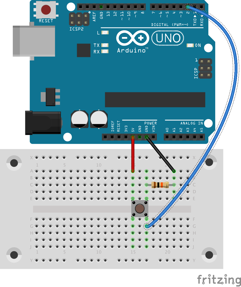
The purpose of this circuit is to be able to read pin 2 on the Arduino, which should read a certain value (HIGH or LOW) when the button is pressed and the opposite value when it’s not pressed. We can do the reading with an Arduino sketch like this:
void setup() {
  pinMode(2, INPUT);
  Serial.begin(9600);
}

void loop() {
  int reading = digitalRead(2);
  Serial.println(reading);
}
But on the hardware side, why is there a resistor? Why are there three wires? How are the electrons flowing through? Compared to other circuits, this looks pretty simple. If I can’t understand this one, then, how can I expect to understand more complex ones? So, here’s my attempt to make sense of this circuit.
Button
Understanding the button’s anatomy is a crucial first step. When a 4-pin button is not pressed, electrons flow only along the vertical axis shown in the diagram. When pressed, electrons flow between all pins. It would seem, then, that this circuit should achieve our purpose:
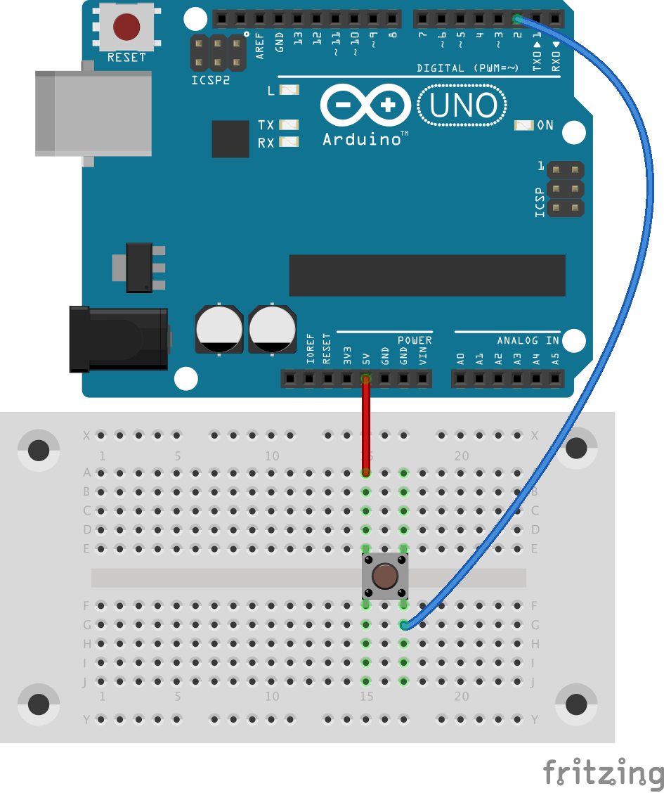
Indeed, this circuit half-works. When the button is pressed, we see HIGH voltage at pin 2. But when it’s not pressed, we get unpredictable values. When the button’s path to 5V is broken, pin 2 is not really connected to anything. It is said to be floating, which means that voltage readings are essentially coming from random electrical noise that the Arduino picks up. To prevent floating, we need to anchor pin 2 to ground—but only when the button’s not pressed.
No Floating
Recall that electrons flow vertically when our button is not pressed. Therefore, our first attempt to unfloat pin 2 might be this:
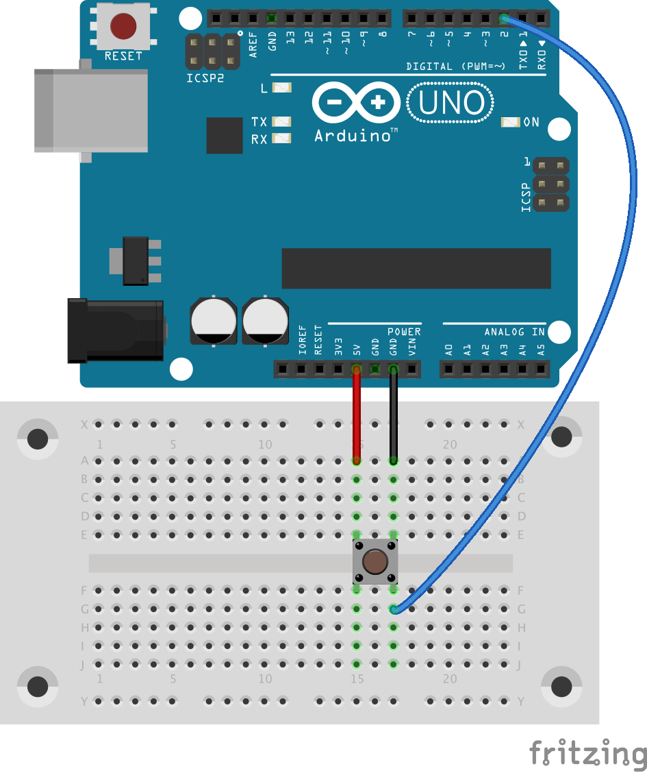
This circuit also half-works, but in the opposite way. When the button’s not pressed, pin 2 reliably reads LOW. But we’ve changed what happens when the button is pressed. Recall that all pins of the button become connected when it’s pressed. That means there will be a path from 5V to ground. Since there’s no load on this path, we have a short circuit, and the fire trucks are on their way.
No Short Circuit
The fix to the short circuit is to discourage electrons flowing from ground to 5V with a resistor. We could put it on the ground side of the circuit, which leads us to the circuit that started our discussion:
When the button’s pressed, pin 2 is connected to 5V and reads HIGH. When it’s not pressed, pin 2 is connected to ground and reads LOW. We say it has been pulled low by a pulldown resistor.
Pullup
Alternatively, we could put the resistor on the 5V side and connect pin 2 to 5V to produce a pullup resistor:
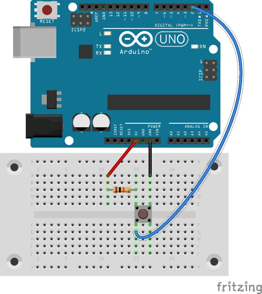
When the button’s pressed, pin 2 is connected to ground and reads LOW. When it’s not pressed, pin 2 is connected to 5V and reads HIGH. This is the exact opposite of the pulldown resistor.
Personally, I feel like the terms pullup resistor and pulldown resistor give too much credit to the resistor. The real reason for the up and down of the voltage is the side of the button we can connect the load to, not the resistor. The resistor gets dropped in where it does as a consequence of the arrangement we choose.
]]>Deprecated: Creation of dynamic property WP_Term::$cat_ID is deprecated in /var/www/twodee/blog/wp-includes/category.php on line 378
Deprecated: Creation of dynamic property WP_Term::$category_count is deprecated in /var/www/twodee/blog/wp-includes/category.php on line 379
Deprecated: Creation of dynamic property WP_Term::$category_description is deprecated in /var/www/twodee/blog/wp-includes/category.php on line 380
Deprecated: Creation of dynamic property WP_Term::$cat_name is deprecated in /var/www/twodee/blog/wp-includes/category.php on line 381
Deprecated: Creation of dynamic property WP_Term::$category_nicename is deprecated in /var/www/twodee/blog/wp-includes/category.php on line 382
Deprecated: Creation of dynamic property WP_Term::$category_parent is deprecated in /var/www/twodee/blog/wp-includes/category.php on line 383
Deprecated: Creation of dynamic property WP_Term::$cat_ID is deprecated in /var/www/twodee/blog/wp-includes/category.php on line 378
Deprecated: Creation of dynamic property WP_Term::$category_count is deprecated in /var/www/twodee/blog/wp-includes/category.php on line 379
Deprecated: Creation of dynamic property WP_Term::$category_description is deprecated in /var/www/twodee/blog/wp-includes/category.php on line 380
Deprecated: Creation of dynamic property WP_Term::$cat_name is deprecated in /var/www/twodee/blog/wp-includes/category.php on line 381
Deprecated: Creation of dynamic property WP_Term::$category_nicename is deprecated in /var/www/twodee/blog/wp-includes/category.php on line 382
Deprecated: Creation of dynamic property WP_Term::$category_parent is deprecated in /var/www/twodee/blog/wp-includes/category.php on line 383
Deprecated: Creation of dynamic property WP_Term::$cat_ID is deprecated in /var/www/twodee/blog/wp-includes/category.php on line 378
Deprecated: Creation of dynamic property WP_Term::$category_count is deprecated in /var/www/twodee/blog/wp-includes/category.php on line 379
Deprecated: Creation of dynamic property WP_Term::$category_description is deprecated in /var/www/twodee/blog/wp-includes/category.php on line 380
Deprecated: Creation of dynamic property WP_Term::$cat_name is deprecated in /var/www/twodee/blog/wp-includes/category.php on line 381
Deprecated: Creation of dynamic property WP_Term::$category_nicename is deprecated in /var/www/twodee/blog/wp-includes/category.php on line 382
Deprecated: Creation of dynamic property WP_Term::$category_parent is deprecated in /var/www/twodee/blog/wp-includes/category.php on line 383
TransportExceptions when trying to pull from a remote Git repository with the EGit plugin in Eclipse. The issue was a missing line in their .git/config. The file should have looked like this:
...
[remote "origin"]
  ...
  fetch = +refs/heads/*:refs/remotes/origin/*
The definition of fetch was absent.
I think the students might have failed to check Configure Fetch when they added the remote, but I can’t be sure.
]]>Deprecated: Creation of dynamic property WP_Term::$cat_ID is deprecated in /var/www/twodee/blog/wp-includes/category.php on line 378
Deprecated: Creation of dynamic property WP_Term::$category_count is deprecated in /var/www/twodee/blog/wp-includes/category.php on line 379
Deprecated: Creation of dynamic property WP_Term::$category_description is deprecated in /var/www/twodee/blog/wp-includes/category.php on line 380
Deprecated: Creation of dynamic property WP_Term::$cat_name is deprecated in /var/www/twodee/blog/wp-includes/category.php on line 381
Deprecated: Creation of dynamic property WP_Term::$category_nicename is deprecated in /var/www/twodee/blog/wp-includes/category.php on line 382
Deprecated: Creation of dynamic property WP_Term::$category_parent is deprecated in /var/www/twodee/blog/wp-includes/category.php on line 383
Deprecated: Creation of dynamic property WP_Term::$cat_ID is deprecated in /var/www/twodee/blog/wp-includes/category.php on line 378
Deprecated: Creation of dynamic property WP_Term::$category_count is deprecated in /var/www/twodee/blog/wp-includes/category.php on line 379
Deprecated: Creation of dynamic property WP_Term::$category_description is deprecated in /var/www/twodee/blog/wp-includes/category.php on line 380
Deprecated: Creation of dynamic property WP_Term::$cat_name is deprecated in /var/www/twodee/blog/wp-includes/category.php on line 381
Deprecated: Creation of dynamic property WP_Term::$category_nicename is deprecated in /var/www/twodee/blog/wp-includes/category.php on line 382
Deprecated: Creation of dynamic property WP_Term::$category_parent is deprecated in /var/www/twodee/blog/wp-includes/category.php on line 383
Deprecated: Creation of dynamic property WP_Term::$cat_ID is deprecated in /var/www/twodee/blog/wp-includes/category.php on line 378
Deprecated: Creation of dynamic property WP_Term::$category_count is deprecated in /var/www/twodee/blog/wp-includes/category.php on line 379
Deprecated: Creation of dynamic property WP_Term::$category_description is deprecated in /var/www/twodee/blog/wp-includes/category.php on line 380
Deprecated: Creation of dynamic property WP_Term::$cat_name is deprecated in /var/www/twodee/blog/wp-includes/category.php on line 381
Deprecated: Creation of dynamic property WP_Term::$category_nicename is deprecated in /var/www/twodee/blog/wp-includes/category.php on line 382
Deprecated: Creation of dynamic property WP_Term::$category_parent is deprecated in /var/www/twodee/blog/wp-includes/category.php on line 383
Do check the Width option of Child Controls Size. This option is poorly named and documented. When unchecked, the size of each child is set by its RectTransform. When checked, the size of each child is determined by its Layout Element component. If this option is checked and the children are without Layout Elements, the children will collapse to their minimum sizes. So, check the option and add Layout Elements to the children.
On each child’s Layout Element, set the Flexible Width property accordingly. Widgets with equal weights will expand at the same rate if the parent has leftover space.
If any child has a weight of 0 or doesn’t have a Flexible Width checked, it will be assigned its minimum size. If you don’t like the default minimum size, assign it on the Layout Element.
It seems like you should be able to set the minimum size in other ways—like with a Content Size Fitter on the child—but I haven’t found this to work. This would be especially nice on buttons, whose minimum size should snugly fit around their text label. I don’t see why the minimum size can’t be automatically calculated.
]]>Deprecated: Creation of dynamic property WP_Term::$cat_ID is deprecated in /var/www/twodee/blog/wp-includes/category.php on line 378
Deprecated: Creation of dynamic property WP_Term::$category_count is deprecated in /var/www/twodee/blog/wp-includes/category.php on line 379
Deprecated: Creation of dynamic property WP_Term::$category_description is deprecated in /var/www/twodee/blog/wp-includes/category.php on line 380
Deprecated: Creation of dynamic property WP_Term::$cat_name is deprecated in /var/www/twodee/blog/wp-includes/category.php on line 381
Deprecated: Creation of dynamic property WP_Term::$category_nicename is deprecated in /var/www/twodee/blog/wp-includes/category.php on line 382
Deprecated: Creation of dynamic property WP_Term::$category_parent is deprecated in /var/www/twodee/blog/wp-includes/category.php on line 383
Deprecated: Creation of dynamic property WP_Term::$cat_ID is deprecated in /var/www/twodee/blog/wp-includes/category.php on line 378
Deprecated: Creation of dynamic property WP_Term::$category_count is deprecated in /var/www/twodee/blog/wp-includes/category.php on line 379
Deprecated: Creation of dynamic property WP_Term::$category_description is deprecated in /var/www/twodee/blog/wp-includes/category.php on line 380
Deprecated: Creation of dynamic property WP_Term::$cat_name is deprecated in /var/www/twodee/blog/wp-includes/category.php on line 381
Deprecated: Creation of dynamic property WP_Term::$category_nicename is deprecated in /var/www/twodee/blog/wp-includes/category.php on line 382
Deprecated: Creation of dynamic property WP_Term::$category_parent is deprecated in /var/www/twodee/blog/wp-includes/category.php on line 383
Deprecated: Creation of dynamic property WP_Term::$cat_ID is deprecated in /var/www/twodee/blog/wp-includes/category.php on line 378
Deprecated: Creation of dynamic property WP_Term::$category_count is deprecated in /var/www/twodee/blog/wp-includes/category.php on line 379
Deprecated: Creation of dynamic property WP_Term::$category_description is deprecated in /var/www/twodee/blog/wp-includes/category.php on line 380
Deprecated: Creation of dynamic property WP_Term::$cat_name is deprecated in /var/www/twodee/blog/wp-includes/category.php on line 381
Deprecated: Creation of dynamic property WP_Term::$category_nicename is deprecated in /var/www/twodee/blog/wp-includes/category.php on line 382
Deprecated: Creation of dynamic property WP_Term::$category_parent is deprecated in /var/www/twodee/blog/wp-includes/category.php on line 383
These are the steps we followed:
- Create a new Render Texture asset. Set its resolution, antialiasing, and other properties according to your whimsy.
- We need a camera to render the scene into this texture on demand. We could create a camera specifically dedicated to this task, or we could just borrow the main camera for a moment. The latter choice means less duplication of configuration, so that’s what we’ll do here. Create the following script:
using UnityEngine;
using System.IO;

public class Screenshotter : MonoBehaviour {
  public RenderTexture renderTexture;

  void Update() {
    // Here we take screenshots when the player hits the S key, but it could
    // just as well have been a button click, time elapsing, or some other
    // condition.
    if (Input.GetKeyDown(KeyCode.S)) {
      TakeScreenshot();
    }
  }

  public void TakeScreenshot() {
    // Force a render to the target texture.
    Camera.main.targetTexture = renderTexture;
    Camera.main.Render();

    // Texture.ReadPixels reads from whatever texture is active. Ours needs to
    // be active. But let's remember the old one so we can restore it later.
    RenderTexture oldRenderTexture = RenderTexture.active;
    RenderTexture.active = renderTexture;

    // Grab ALL of the pixels.
    Texture2D raster = new Texture2D(renderTexture.width, renderTexture.height);
    raster.ReadPixels(new Rect(0, 0, renderTexture.width, renderTexture.height), 0, 0);
    raster.Apply();

    // Write them to disk. Change the path and type as you see fit.
    File.WriteAllBytes("screenshot.png", raster.EncodeToPNG());

    // Restore previous settings.
    Camera.main.targetTexture = null;
    RenderTexture.active = oldRenderTexture;

    Debug.Log("Screenshot saved.");
  }
}
- Add the script to your main camera—or any singleton object in your scene. Wire in the render texture to its public variable.
This will capture normal GameObjects visible to the camera. But it will not capture any Canvas that is a screen-space overlay. I don’t know if this is a bug or technical impossibility. Hopefully you can switch to camera or world space.
I assure you, the poster looked sharp.
]]>Deprecated: Creation of dynamic property WP_Term::$cat_ID is deprecated in /var/www/twodee/blog/wp-includes/category.php on line 378
Deprecated: Creation of dynamic property WP_Term::$category_count is deprecated in /var/www/twodee/blog/wp-includes/category.php on line 379
Deprecated: Creation of dynamic property WP_Term::$category_description is deprecated in /var/www/twodee/blog/wp-includes/category.php on line 380
Deprecated: Creation of dynamic property WP_Term::$cat_name is deprecated in /var/www/twodee/blog/wp-includes/category.php on line 381
Deprecated: Creation of dynamic property WP_Term::$category_nicename is deprecated in /var/www/twodee/blog/wp-includes/category.php on line 382
Deprecated: Creation of dynamic property WP_Term::$category_parent is deprecated in /var/www/twodee/blog/wp-includes/category.php on line 383
Deprecated: Creation of dynamic property WP_Term::$cat_ID is deprecated in /var/www/twodee/blog/wp-includes/category.php on line 378
Deprecated: Creation of dynamic property WP_Term::$category_count is deprecated in /var/www/twodee/blog/wp-includes/category.php on line 379
Deprecated: Creation of dynamic property WP_Term::$category_description is deprecated in /var/www/twodee/blog/wp-includes/category.php on line 380
Deprecated: Creation of dynamic property WP_Term::$cat_name is deprecated in /var/www/twodee/blog/wp-includes/category.php on line 381
Deprecated: Creation of dynamic property WP_Term::$category_nicename is deprecated in /var/www/twodee/blog/wp-includes/category.php on line 382
Deprecated: Creation of dynamic property WP_Term::$category_parent is deprecated in /var/www/twodee/blog/wp-includes/category.php on line 383
Deprecated: Creation of dynamic property WP_Term::$cat_ID is deprecated in /var/www/twodee/blog/wp-includes/category.php on line 378
Deprecated: Creation of dynamic property WP_Term::$category_count is deprecated in /var/www/twodee/blog/wp-includes/category.php on line 379
Deprecated: Creation of dynamic property WP_Term::$category_description is deprecated in /var/www/twodee/blog/wp-includes/category.php on line 380
Deprecated: Creation of dynamic property WP_Term::$cat_name is deprecated in /var/www/twodee/blog/wp-includes/category.php on line 381
Deprecated: Creation of dynamic property WP_Term::$category_nicename is deprecated in /var/www/twodee/blog/wp-includes/category.php on line 382
Deprecated: Creation of dynamic property WP_Term::$category_parent is deprecated in /var/www/twodee/blog/wp-includes/category.php on line 383
RectTransform can be used to achieve a couple of common multi-column UI patterns. I describe here how to achieve these using only anchors, offsets, and pivots—and not any layout groups.
Percentage-based N-column Layout
If your layout requires multiple columns and each column is apportioned a percentage of the total display, set each column’s X anchors according to the percentages allotted to each. If the columns consume 50%, 30%, and 20% of the parent, then the X anchors should be set to [0, 0.5], [0.5, 0.8], and [0.8, 1].
Fill the parent vertically by setting the Y anchors of all columns to [0, 1].
If the child elements of each column should fill the column, then set the left, top, right, and bottom properties to 0.
Fixed-width Two-column Layout
If your layout requires two columns and one column is apportioned a fixed number of pixels W and the other column should fill the remaining space, you will need to adjust both the anchors and pivots.
First, fill the parent vertically by setting the Y anchors of both columns to [0, 1].
Fixed Right
If the fixed-width column is on the right, set its X anchors to [1, 1]. This makes the reference point the right edge of the parent. We want to align the right edge of the column with the right edge of the parent, so set the pivot to [1, ?]. Finally, set the width of the fixed column to W pixels. Set the X position, top, and bottom to 0.
On the variable-width column, have it fill the parent horizontally by setting the X anchors to [0, 1]. The value of the pivot is irrelevant—but changing it after the other properties have been set will likely undesirably alter them. Set left, top, bottom to 0, and right to W.
Fixed Left
If the fixed-width column is on the left, set its X anchors to [0, 0]. This makes the reference point the left edge of the parent. We want to align the left edge of the column with the left edge of the parent, so set the pivot to [0, ?]. Finally, set the width of the fixed column to W pixels. Set the X position, top, and bottom to 0.
On the variable-width column, have it fill the parent horizontally by setting the X anchors to [0, 1]. The value of the pivot is irrelevant—but changing it after the other properties have been set will likely undesirably alter them. Set top, right, and bottom to 0, and left to W.
Fixed-width Three-column Layout
If your layout requires three columns, with the fixed width columns on the left and right and a variable-width column in the middle, you can combine the fixed right and fixed left patterns described above.
Padding
If you want a fixed amount of padding within a column, then set left, top, right, and bottom to the desired number of pixels. If you want a percentage-based amount of padding, then add the proportion to the minimum X anchor and subtract it from the maximum X anchor.
]]>