CS 268: Lecture 4 – Boxes
Dear students:
At the heart of our browser’s rendering algorithm is the CSS box model. Today we explore this in some detail. By the end, we should be able to make a page that looks like this:
Box Model
When the browser renders an element from your HTML file, two things it must determine are where to render it and how big to make it. The rules describing how the position and size are determined are called the CSS box model. Around each element of content, the browser constructs a box that is sized according to these properties:
displaywidthandheightpaddingbordermarginbox-sizing
We will come to understand how these properties influence the box size by constructing a page that illustrates their role.
We start with this outer parent box that just acts as a shell:
<body>
  <div class="outer">
  </div>
</body>
To center this box, we use the following CSS, which gets into things we’ll discuss next week:
body {
  display: flex;
  align-items: center;
  justify-content: center;
  height: 100vh;
}

.outer {
  background-color: #FF90E2;
}
Now let’s add an inner box with some content:
<div class="outer">
  <div class="inner">CONTENT</div>
</div>
Let’s give it a background color to distinguish it from outer.
.inner {
  background-color: #A9CCCC;
}
What can we say about the box that the browser constructs to render inner? By default, it wraps snugly around the content. Let’s set these properties, one by one, to see how the box changes:
.inner {
  background-color: #A9CCCC;
  margin: 10px;
  border: 3px dashed #FFF6C9;
  padding: 20px;
}
We see that margin is the outermost layer of the box. What determines its color? It’s the parent, not the child element. padding is the innermost layer, and it does include the child’s background. And border sits between them. It also reveals the child’s background color, but we can only see this if we use a border style that’s intermittent.
These properties do not have to be uniform across the four sides of the box. If we want a different margin on each side, for example, we’d say:
.inner {
  margin: 10px 20px 30px 40px;
}
The order for the 4-value syntax is top-right-bottom-left, or north-east-south-west. We can also provide just two values to get symmetry across both axes:
.inner {
  margin: 10px 20px;
}
The order for the 2-value syntax is vertical-horizontal.
Padding and the non-shorthand border properties (border-color, border-width, and border-style) are treated similarly. We can also append suffices to influence single sides:
.inner {
  border-top: 1px solid black;
  border-bottom: 1px solid black;
}
These three properties influence the box but they are really just extensions of the core content box. We can set the size of the content box with the width and height properties:
.inner {
  width: 200px;
  height: 200px;
}
There are times where are concerned with the overall footprint of the element. Suppose we are creating cards that need to be exactly 200×200, from edge to edge. We could subtract out the border and padding from the target size to determine the width and height, but that’s clumsy. Instead, we can set the box-sizing property to change the box to which the dimensions apply:
.inner {
  box-sizing: border-box;
}
The default is content-box. There is no margin-box nor padding-box.
Display
The rules described above are accurate for block elements. But boxes around inline elements are different. Let’s show these by changing inner to an inline element. We could make it a span, or we can alter its display property like so:
.inner {
  display: inline;
}
By default, the browser sets the display property of div to block.
We notice the following differences in inline boxes:
widthandheightare ignored. The box cannot be explicitly sized.- The top and bottom margins are ignored.
To show another difference, let’s embed some neighboring content:
<div class="outer">
  BEFORE
  <div class="inner">
  CONTENT
  </div>
  AFTER
</div>
Block boxes appear on their own line, whereas inline boxes appear next to their neighbors, wrapping where necessary.
Sometimes we want boxes to both be sizable and to appear on the same line. For instance, suppose we had two instances of inner, like this:
<div class="outer">
  <div class="inner">CONTENT</div>
  <div class="inner">CONTENT</div>
</div>
To get them to appear sized properly and side by side, we use a blend of the two display types:
.inner {
  display: inline-block;
}
That’s enough background. Let’s put it to use in an exercise.
Activity
With exactly one neighbor, claim your task on Crowdsource.
Create 300-by-300 cards for a few letters from the alphabet that might appear in an ABC book for children. Each card contains an image of an object starting with the card’s letter, with a label below of the form “LETTER is for OBJECT”. For instance, an A card might have an image of a fellow shoveling coal into the boiler of a steam engine and a label that reads “A is for ASHCAT.”
Fulfill these additional requirements:
- Have the cards sit right next to each other, with absolutely no gap between them.
- Have the first card sit at the top-left corner of the browser’s viewport, with no gap between the card and the browser’s “chrome.”
- Surround each card with some kind of border.
- Give the cards a background color.
- Use external image URLs.
- Use id-based selectors in your CSS.
- Ensure the entire card, border and all, is 300×300.
Use the letters designated by your task number in the following list:
- Take A through C.
- Take D through F.
- Take G through I.
- Take J through L.
- Take M through O.
- Take P through R.
- Take S through U.
- Take V through X.
- Take Y through Z.
When you are done, submit only the relevant HTML and CSS on Crowdsource.
Pseudo-classes and Feedback
We can spice up our alphabet cards by making them slightly interactive. When the mouse passes over a card, we can highlight it in some way. But how we do apply style rules to items under the mouse? We use the :hover pseudo-class in our selector, like so:
div:hover {
  /* ... */
}
How shall we highlight the hovered card? Well, we could alter the border:
div:hover {
  border: 10px dotted red;
}
But if our border is a different size, this rule causes our content to dance or reflow. Reflowing should not happen in any website that you design. In this particular situation, we can use outline instead of border:
div:hover {
  outline: 10px dotted red;
}
Outlines are overlays that lie outside the border box. They don’t cause shifts to the layout.
There are other places where hover anomalies can occur. This page, for example, alters the link’s box shape when it’s hovered, which means the box is no longer hovered, which restores the box shape, which means we are hovering again, and so on:
<!DOCTYPE html>
<html>
  <head>
    <title>Dancing</title>
    <style>
a {
  padding: 10px;
  text-decoration: none;
  font-size: 128pt;
}

a:hover {
  background-color: #DDDDDD;
  border-radius: 1em;
}
    </style>
  </head>
  <body>
    <a href="#">A</a>
  </body>
</html>
This example is inspired by a bug I found on the Firefox mailing list from September 2011. It still hasn’t been fixed. Probably because it’s hard.
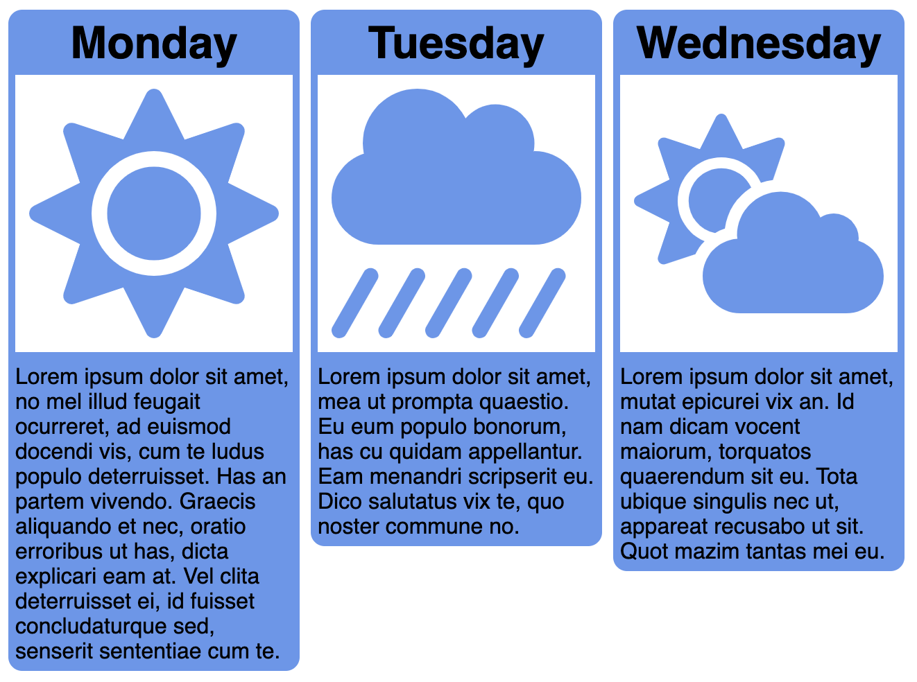
Example
Now, let’s apply all these ideas by reverse engineering this page:
The images come from Font Awesome.
TODO
Here’s your TODO list for next time:
- Read the project 1 specification.
- Keep directing your own learning. Read and watch to fill in any gaps in your knowledge.
See you next time.

P.S. It’s time for a haiku!
Why is pizza round?
We’d have more cheese on a square
But also more crust