CS 268: Lecture 5 – Flexbox
Dear students:
Last time we explored the box model that guides our browser’s rendering algorithm. Today we examine the relatively modern Flexible Box system for CSS, which can be used to automatically set the properties of our boxes to achieve many of our standard layouts.
But first, let’s review the box model by completing an exercise.
Activity
With exactly one neighbor, claim your task on Crowdsource. (Everyone will be assigned task 1.) Then recreate the following page:
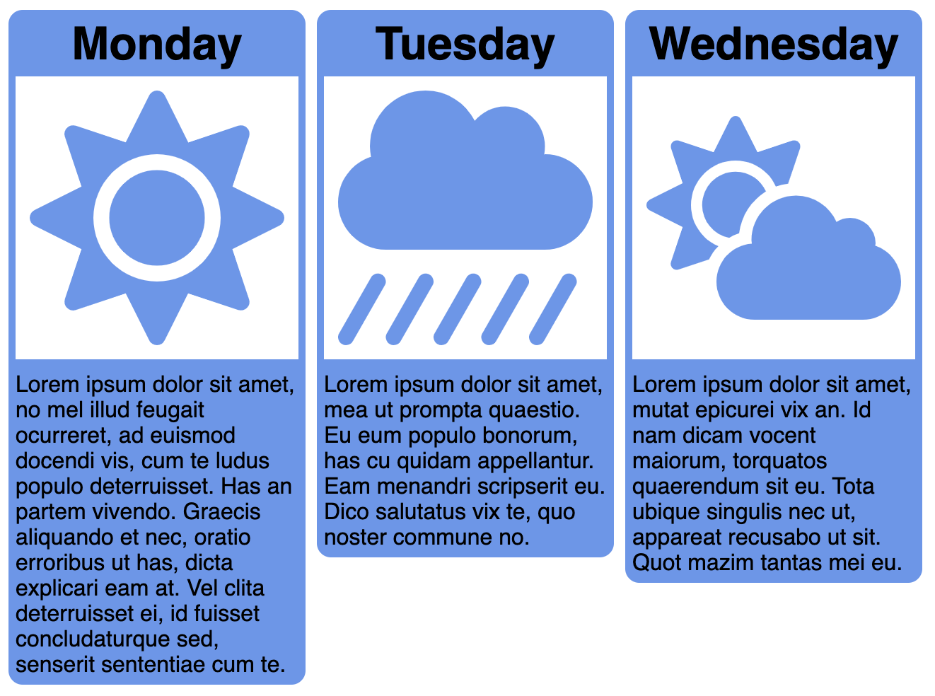
Link to these images, which are courtesy of Font Awesome:
Grab random text from a Lorem Ipsum generator, like this one.
Flexbox
Compared to the rich GUI libraries available for desktop applications, arranging content on a webpage is a pain. At least, it was until Flexbox came along. Flexbox allows you to create a box whose children can be laid out horizontally or vertically. If the children consume too much of the available space, you can specify how the content is shrunk or wrapped. If the children consume too little of the available space, you can specify how the content is distributed.
Let’s explore the two kinds of actors in a layout driven by Flexbox.
Flex Container
The first actor is the flex container, the element whose layout is being determined by Flexbox. We need to set its display property and the direction in which its children are laid out, like this:
.container {
  display: flex;
  flex-direction: column;
}
The flex-direction property specifies what is called the main axis. Possible values for the direction include row and column. The other axis is called the cross axis.
Out of the box, the children of the flex container are flushed to the start, taking up their normal size along the main axis and stretching to fill the cross axis.
We adjust how the children are distributed along the main axis with the justify-content property, which accepts the following values:
flex-start, which is the default and which pushes the children to the beginning of the containerflex-end, which pushes the children to the end of the containercenter, which centers the children in the containerspace-between, which spreads the children out in ac__c__cpattern.space-around, which spreads the children out in a_c__c__c_pattern.space-evenly, which spreads the children out in a_c_c_c_pattern.
We adjust how the children are distributed along the cross axis with the align-items property, which accepts the following values:
flex-start, which pushes the children to the beginning of the containerflex-end, which pushes the children to the end of the containercenter, which centers the children in the containerstretch, which expands the children to fill the containerbaseline, which aligns the children on the line that letters rest on
Enumerating all of these properties is not really learning them. To help internalize their behavior, I hastily coded up a little game called Flexercise to help visualize the layouts that these properties make possible. We’ll play a few rounds during class. (At the moment it has some issues in Chrome with overflow that I think are due to bugs in the browser. Firefox and Safari seem to handle overflow okay.)
Flex Child
We call the elements tucked directly inside a flex container the flex children. The child elements may already be sized and position the way we want them by the properties set on the container. But if not, we can tweak them with several child properties.
By default, the children appear along the direction of flow in their order of expression. The order property can be used to override this. But certain tasks like tabbing through the elements will still traverse them in expression order, and in general, letting the visual order diverge from the structural order will lead to a poor user experience.
We alter the cross-axis alignment per child with the align-self property. For example, the parent might have each child stretch, but we override this for one of the children by setting align-self to center.
When the flex container has leftover space, that space by default will be portioned out according to the justify-content algorithm. Sometimes, however, we want the children to grow into the extra space. For that, we use the flex-grow property. Each element requests a number of “units” of this extra space. By default, each child requests 0 units. All the requests are summed together, and each child is awarded its computed proportion.
If only one child sets its flex-grow property to a non-zero number N, then it will be awarded N / N = 100% of the space. If there are two children each with flex-grow set to 1, each will be awarded 1/2 of the space.
Note that the flex-grow values are not the same as the relative sizes of the children—because before the same extra space is divided, the children are sized according to their flex-basis property. By default, flex-basis is set to auto, which means the children are sized according to their width or height properties first and only then given any extra space. If we truly want flex-grow to determine the relative size of each child, we can set flex-basis to 0 and let flex-grow expand the children.
Let’s now recreate a few standard layouts.
Centering
Centering an element both horizontal and vertically is made much easier with Flexbox. We style our container like so:
body {
  display: flex;
  justify-content: center;
  align-items: center;
  margin: 0;
  height: 100%;
}
For that height property to have any effect, we need to all set the height of the parent to fill the window, like this:
html {
  height: 100%;
}
Then we add exactly one flex child, which will be perfectly centered.
Navigation Links
Many pages support a sequence of navigation links below the header. Flexbox can help with those too. Suppose this is our nav element:
<nav>
  <ul>
    <li>About</li>
    <li>Blog</li>
    <li>Contact</li>
    <li>Donate</li>
  </ul>
</nav>
We turn the list into a row of flex children with this style:
ul {
  list-style: none;
  display: flex;
  flex-direction: row;
  justify-content: flex-end;
  margin: 0;
}
And we decorate and pad the list items as we see fit.
Holy Grail
The holy grail layout consists of five elements, much like Swing’s BorderLayout. There’s a header, footer, two sidebars, and a central area for content. This pattern is commonly seen on blogs.
We use the following structure:
<div id="root">
  <header>...</header>
  <div id="chester">
    <div id="left-arm">...</div>
    <div id="heart">...</div>
    <div id="right-arm">...</div>
  </div>
  <footer>...</footer>
</div>
Note that this layout is two-dimensional. Flexbox is mostly a tool for one-dimensional layouts. But we can nest them.
First, let’s get the content filling the window with these rules:
html, body {
  height: 100%;
}

body {
  margin: 0;
}
Then we style our outer root element to flow downward like this:
#root {
  display: flex;
  flex-direction: column;
  align-items: stretch;
}
The middle or chester element we want to expand, and we also want it to lay out its children in a row, so we apply this style:
#chester {
  flex-grow: 1;

  display: flex;
  flex-direction: row;
  align-items: stretch;
}
We set the heart to take up any leftover space with this rule:
#heart {
  flex-grow: 1;
}
And we size the sidebars and keep them from shrinking with these rules:
#left-arm, #right-arm {
  flex-shrink: 0;
  flex-basis: 200px;
}
TODO
Here’s your TODO list for next time:
- Play Flexbox Froggy.
- Play Flexercise.
- Attend your weekly check-in.
- Add a new blog post before Monday about something new that you learn about HTML, CSS, or Javascript. Be sure to include a couple of paragraphs of your own text, some code examples, and links to your sources. Also, make sure that I can find this second post when I visit
http://YOUR-IP-ADDRESS:8000. Do not delete your first post.
See you next time.

P.S. It’s time for a haiku!
My school newspaper
Its boxes were flexible
We cut and glued them
P.P.S. Here’s the code we wrote together in class.
weather.html
<!doctype html>
<html lang="en">
    <head>
        <title>Weather</title>
        <style>
            img {
                background-color: white;
            }
            div {
                vertical-align: top;
                display: inline-block;
                background-color: cornflowerblue;
                width: 300px;
                border-radius: 25px;
                padding: 10px;
            }
            h1 {
              margin: 0;
            }
            img {
              width: 100%;
              height: 200px;
              padding: 20px;
              box-sizing: border-box;
            }
            .name {
                text-align: center;
                vertical-align: center;
            }
        </style>
    </head>
    <body>
        <div class="monday">
            <h1 class="name">Monday</h1>
            <img src="https://twodee.org/gray/webdev/2020a/05_flexbox/sun.svg">
            <p>text</p>
        </div>
        <div class="tuesday">
          <h1 class="name">Monday</h1>
          <img src="https://twodee.org/gray/webdev/2020a/05_flexbox/rain.svg">
          <p>text</p>
        </div>
        <div class="wednesday">
          <h1 class="name">Monday</h1>
          <img src="https://twodee.org/gray/webdev/2020a/05_flexbox/cloud_sun.svg">
          <p>text</p>
        </div>
    </body>
</html>