CS 268: Lecture 7 – Flexbox Continued
Dear students:
Last week we saw how we can use Flexbox to size and distribute our boxes of content across a container. Today we continue to explore Flexbox and see how to recreate some common layouts found across the web.
But first, let’s review Flexbox by completing an exercise.
Flexbox
Last time we looked at only the properties of the flex container. Let’s round out our discussion of Flexbox by looking at the flex children. The flex children may already be sized and position the way we want them by the properties set on the container. But if not, we can tweak them with several child properties.
By default, the children appear along the direction of flow in their order of expression. The order property can be used to override this. But certain tasks like tabbing through the elements will still traverse them in expression order, and in general, letting the visual order diverge from the structural order will lead to a poor user experience.
We alter the cross-axis alignment per child with the align-self property. For example, the parent might have each child stretch, but we override this for one of the children by setting align-self to center.
When the flex container has leftover space, that space by default will be portioned out according to the justify-content algorithm. Sometimes, however, we want the children to grow into the extra space. For that, we use the flex-grow property. Each element requests a number of “units” of this extra space. By default, each child requests 0 units. All the requests are summed together, and each child is awarded its computed proportion.
If only one child sets its flex-grow property to a non-zero number N, then it will be awarded N / N = 100% of the space. If there are two children each with flex-grow set to 1, each will be awarded 1/2 of the space.
Note that the flex-grow values are not the same as the relative sizes of the children—because before the same extra space is divided, the children are sized according to their flex-basis property. By default, flex-basis is set to auto, which means the children are sized according to their width or height properties first and only then given any extra space. If we truly want flex-grow to determine the relative size of each child, we can set flex-basis to 0 and let flex-grow expand the children.
If there’s not enough space for the children, space is taken away from according to their flex-shrink values. By default the shrink values are 1, meaning that each element loses the same amount of extra space. If we want a child to not shrink, we set it’s flex-shrink to 0.
There’s this shorthand rule for setting all three of the properties that size a child along the main axis:
.child {
  flex: GROW SHRINK BASIS;
}
Let’s apply these ideas to create some common layouts.
N-column
As an example of an n-column layout, consider CodePen. In fact, let’s just crudely recreate CodePen. We use this HTML structure:
<body>
  <div id="editor-root">
    <textarea id="html-editor" class="editor"></textarea>
    <textarea id="css-editor" class="editor"></textarea>
  </div>
  <iframe id="preview"></iframe>
</body>
We split the editor-root into two columns that get an equal share of the leftover space using these rules:
#editor-root {
  display: flex;
  flex-direction: row;
}

.editor {
  flex: 1;
}
We split the body into two rows, one of fixed height and one that grows using these rules:
html, body {
  height: 100%;
}

body {
  margin: 0;
  display: flex;
  flex-direction: column;
}

#editor-root {
  flex: 0 1 300px;
  /* ... */
}

#preview {
  flex: 1;
}
Let’s sneak in this Javascript so that edits to the text boxes actually generate a preview in the iframe:
let htmlEditor = document.getElementById('html-editor');
let cssEditor = document.getElementById('css-editor');
let preview = document.getElementById('preview');

function updatePreview() {
  preview.srcdoc = `
<html>
  <head>
    <title>Preview</title>
    <style>${cssEditor.value}</style>
  </head>
  <body>${htmlEditor.value}</body>
</html>`;
}

htmlEditor.addEventListener('input', updatePreview);
cssEditor.addEventListener('input', updatePreview);
Holy Grail
Another common layout we find on the web is the holy grail, which consists of five elements, much like Swing’s BorderLayout. There’s a header, footer, two sidebars, and a central area for content. This pattern is commonly seen on blogs.
We use the following structure:
<div id="root">
  <header>...</header>
  <div id="chester">
    <div id="left-arm">...</div>
    <div id="heart">...</div>
    <div id="right-arm">...</div>
  </div>
  <footer>...</footer>
</div>
Note that this layout is two-dimensional. Flexbox is mostly a tool for one-dimensional layouts. But we can nest them.
First, let’s get the content filling the window with these rules:
html, body {
  height: 100%;
}

body {
  margin: 0;
}
Then we style our outer root element to flow downward like this:
#root {
  display: flex;
  flex-direction: column;
  align-items: stretch;
}
The middle or chester element we want to expand, and we also want it to lay out its children in a row, so we apply this style:
#chester {
  flex-grow: 1;

  display: flex;
  flex-direction: row;
  align-items: stretch;
}
We set the heart to take up any leftover space with this rule:
#heart {
  flex-grow: 1;
}
And we size the sidebars and keep them from shrinking with these rules:
#left-arm, #right-arm {
  flex-shrink: 0;
  flex-basis: 200px;
}
Wrapping
If the children of a flex container have all been shrunk to their utmost and there still is not enough room for them, they can be made to wrap along the cross axis using the flex-wrap property. Valid values include nowrap, wrap, and wrap-reverse. We’ll see these at work in Flexercise.
Activity
With exactly one neighbor, claim your task on Crowdsource. (Everyone will be assigned task 1.) Then recreate the following page:
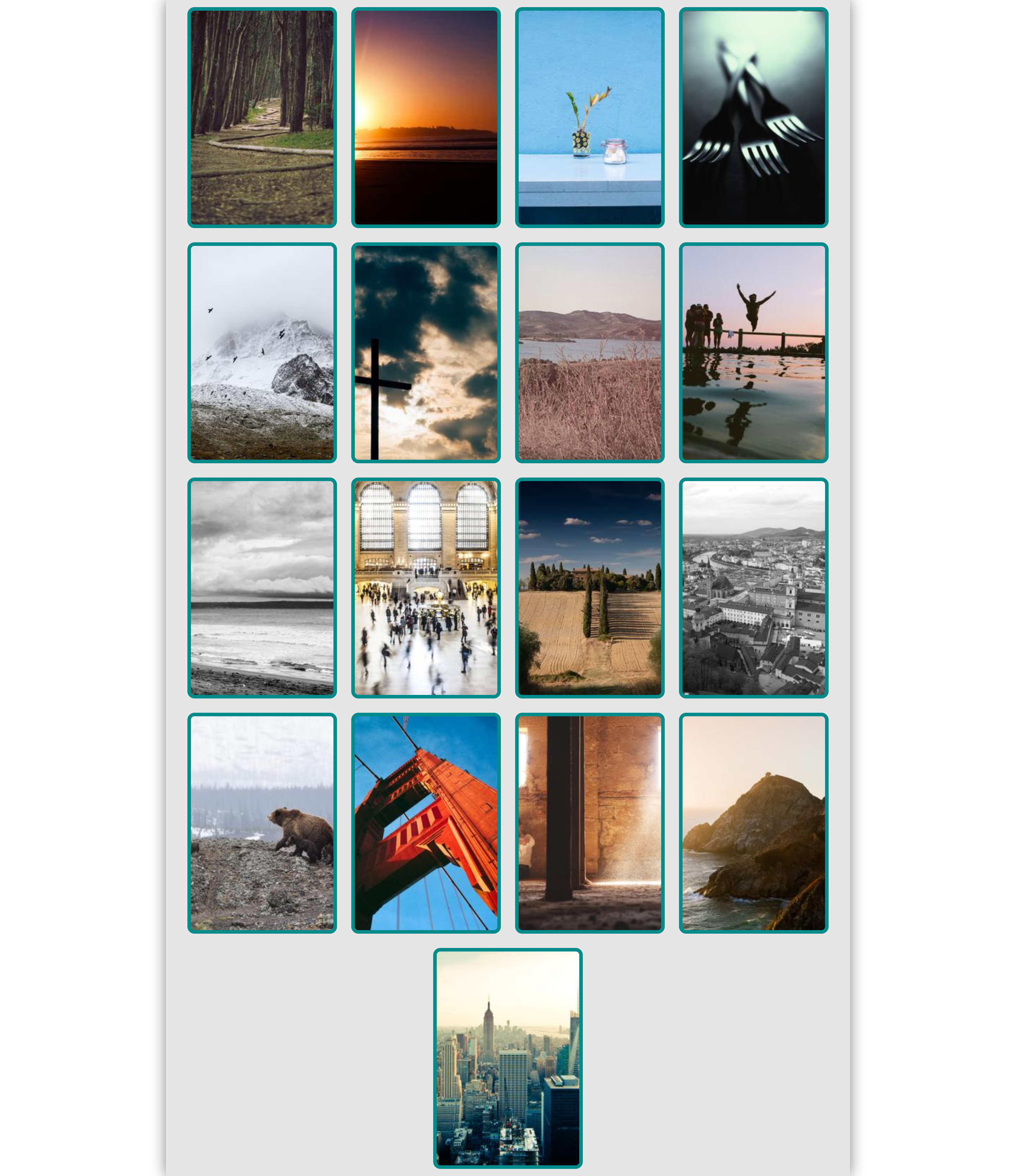
Apply styling to the following starter code to match the page above:
<!DOCTYPE html>
<html>

<head>
  <title>Gallery</title>
  <style>

/* Add your CSS here. */

#root {
  width: 960px;
}

  </style>
</head>

<body>
  <div id="root">
    <div class="card"><img src="https://picsum.photos/200/300?random=1"></div>
    <div class="card"><img src="https://picsum.photos/200/300?random=2"></div>
    <div class="card"><img src="https://picsum.photos/200/300?random=3"></div>
    <div class="card"><img src="https://picsum.photos/200/300?random=4"></div>
    <div class="card"><img src="https://picsum.photos/200/300?random=5"></div>
    <div class="card"><img src="https://picsum.photos/200/300?random=6"></div>
    <div class="card"><img src="https://picsum.photos/200/300?random=7"></div>
    <div class="card"><img src="https://picsum.photos/200/300?random=8"></div>
    <div class="card"><img src="https://picsum.photos/200/300?random=9"></div>
    <div class="card"><img src="https://picsum.photos/200/300?random=10"></div>
    <div class="card"><img src="https://picsum.photos/200/300?random=11"></div>
    <div class="card"><img src="https://picsum.photos/200/300?random=12"></div>
    <div class="card"><img src="https://picsum.photos/200/300?random=13"></div>
    <div class="card"><img src="https://picsum.photos/200/300?random=14"></div>
    <div class="card"><img src="https://picsum.photos/200/300?random=15"></div>
    <div class="card"><img src="https://picsum.photos/200/300?random=16"></div>
    <div class="card"><img src="https://picsum.photos/200/300?random=17"></div>
  </div>
</body>

</html>
Notice how the content is centered. We have used Flexbox to achieve vertical and horizontal centering. To achieve horizontal centering only, we have another option:
- Set the width of the content to be centered.
- Set the horizontal margin of the content to be centered to
auto.
Notice also the shadowing, which was achieved with the box-shadow property.
Submit your solution on Crowdsource.
TODO
Here’s your TODO list for next time:
- Add a new blog post before Monday about something new that you learn about HTML, CSS, or Javascript. Be sure to include a couple of paragraphs of your own text, some code examples, and links to your sources. Also, make sure that I can find this new post when I visit
http://YOUR-IP-ADDRESS:8000. Do not delete your earlier posts. - At each of your weekly check-ins, you are expected to demonstrate progress on your project. There will not usually be particular requirements. Show your teaching assistant or instructor that you’ve been working steadily. Share troubles you’ve run into. Ask questions for troubles that you haven’t resolved. By next week you should have a rough layout of your site ready to share, with your Git repository set up and an HTTPS site being served out.
See you next time.

P.S. It’s time for a haiku!
Life is like Flexbox
Youth and work areflex: 0
The rest is old age
P.P.S. Here’s the code we wrote together in class…
codepen.html
<!DOCTYPE html>

<html lang="en">
<head>
  <title></title>
  <style>
html {
  height: 100%;
}

body {
  margin: 0;
  display: flex;
  flex-direction: column;
  height: 100%;
}

#editor-root {
  display: flex;
  flex-direction: row;
  flex-basis: 200px;
}

.editor {
  flex-grow: 1;
}

#preview {
  flex-grow: 1;
}

  </style>
</head>

<body>
  <div id="editor-root">
    <textarea id="html-editor" class="editor"></textarea>
    <textarea id="css-editor" class="editor"></textarea>
  </div>

  <iframe src="https://twodee.org" id="preview"></iframe>


  <script>

const htmlEditor = document.getElementById('html-editor');
const cssEditor = document.getElementById('css-editor');
const preview = document.getElementById('preview');

function updatePreview() {
  const html = `
<html>
  <head>
    <style>
      ${cssEditor.value}
    </style>
  </head>
  <body>
    ${htmlEditor.value}
  </body>
</html>
  `;
  console.log(html);
  preview.srcdoc = html;
}

htmlEditor.addEventListener('input', updatePreview);
cssEditor.addEventListener('input', updatePreview);

  </script>
</body>

</html>
holygrail.html
<!DOCTYPE html>

<html lang="en">
  <head>
    <title></title>
    <style>
html, body, #root {
  height: 100%;
}


body {
  margin: 0;
}

#root {
  display: flex;
  flex-direction: column;
}

#chester {
  flex-grow: 2;
  display: flex;
  flex-direction: row;
}

#left-arm {
  background-color: purple;
  flex-basis: 200px;
}

#right-arm {
  background-color: pink;
  flex-basis: 200px;
}

#torso {
  background-color: red;
  flex-grow: 1;
}

header {
  background-color: blue;
}

footer {
  background-color: green;
}

    </style>
  </head>

  <body>

    <div id="root">
      <header>header</header>
      <div id="chester">
        <div id="left-arm">left</div>
        <div id="torso">torso</div>
        <div id="right-arm">right</div>
      </div>
      <footer>footer</footer>
    </div>

  </body>
</html>