CS 268: Lecture 8 – Position
Dear students:
Prior to 1998, CSS was mostly a vehicle for factoring the coloring, sizing, and alignment attributes out of HTML into a reusable stylesheet. But in 1998, CSS gained a new property: position. This opened the door to thinking of CSS as a tool for layout. Eventually we got robust layout systems like Flexbox and Grid, but position is still useful to achieve certain effects. We begin exploring those effects today.
But first, let’s complete an exercise!
Activity
If the children of a flex container have all been shrunk to their utmost and there still is not enough room for them, they can be made to wrap along the cross axis using the flex-wrap property. Valid values include nowrap, wrap, and wrap-reverse. We’ll see these at work in Flexercise.
With exactly one neighbor, claim your task on Crowdsource. (Everyone will be assigned task 1.) Then recreate the following page:
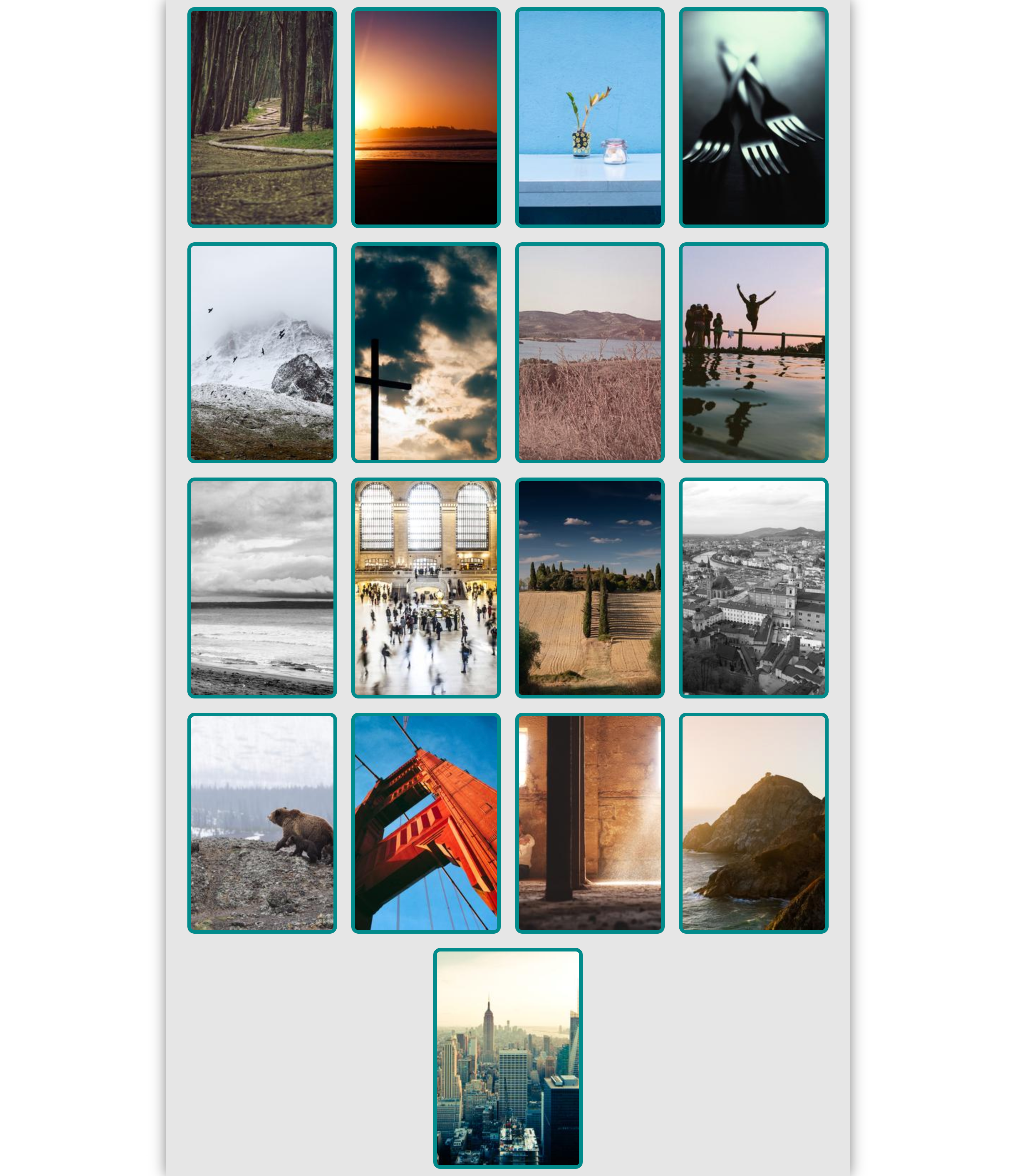
Apply styling to the following starter code to match the page above:
<!DOCTYPE html>
<html>

<head>
  <title>Gallery</title>
  <style>

/* Add your CSS here. */

#root {
  width: 960px;
}

  </style>
</head>

<body>
  <div id="root">
    <div class="card"><img src="https://picsum.photos/200/300?random=1"></div>
    <div class="card"><img src="https://picsum.photos/200/300?random=2"></div>
    <div class="card"><img src="https://picsum.photos/200/300?random=3"></div>
    <div class="card"><img src="https://picsum.photos/200/300?random=4"></div>
    <div class="card"><img src="https://picsum.photos/200/300?random=5"></div>
    <div class="card"><img src="https://picsum.photos/200/300?random=6"></div>
    <div class="card"><img src="https://picsum.photos/200/300?random=7"></div>
    <div class="card"><img src="https://picsum.photos/200/300?random=8"></div>
    <div class="card"><img src="https://picsum.photos/200/300?random=9"></div>
    <div class="card"><img src="https://picsum.photos/200/300?random=10"></div>
    <div class="card"><img src="https://picsum.photos/200/300?random=11"></div>
    <div class="card"><img src="https://picsum.photos/200/300?random=12"></div>
    <div class="card"><img src="https://picsum.photos/200/300?random=13"></div>
    <div class="card"><img src="https://picsum.photos/200/300?random=14"></div>
    <div class="card"><img src="https://picsum.photos/200/300?random=15"></div>
    <div class="card"><img src="https://picsum.photos/200/300?random=16"></div>
    <div class="card"><img src="https://picsum.photos/200/300?random=17"></div>
  </div>
</body>

</html>
Notice how the content is centered. We have used Flexbox to achieve vertical and horizontal centering. To achieve horizontal centering only, we have another option:
- Set the width of the content to be centered.
- Set the horizontal margin of the content to be centered to
auto.
Notice also the shadowing, which was achieved with the box-shadow property.
Submit your solution on Crowdsource.
Position
Normally, our boxes of content are positioned within the flow of the document. An inline element appears to the right of its predecessor box if there’s room, or on the next line if there’s not. A block element appears below its predecessor box and above its successor box. What is true of a page where flow strictly follows this pattern of succession? It’s flat and rigid.
More interesting layouts can be achieved if we allow elements to break out of this flow. We can do this with the position property in CSS. By default, our elements are all have static positions. There are three other widely supported options: relative, absolute, and fixed. Each lets us anchor an element to some box on our page. Where they differ is in what that anchor box is. Once the anchor is identified, we position and size an element using offsets from that anchor.
Let’s examine each of these position values in turn.
Relative
An element with a relative position is anchored against the box it would have if it had a static position. But the element’s box can be shaped relative to the static box with one or more of the four edge properties: left, right, top, and bottom. The box that is shaped appears to be the margin-box, though I’ve only deduced this from the browsers I have handy.
For example, we can shift an element down from its normal position with this style:
.shifted {
  position: relative;
  top: 15px;
}
Note that the shifted content does cause the neighboring content to reflow. This can lead to stacking.
Fixed
An element with a fixed position is anchored against the viewport of the browser. This kind of positioning is often used to make what is called a heads-up display in games, which are UI elements like mini-maps and health bars that are laid over the screen and don’t move with the rest of the content.
For example, we can make a message appear at the bottom of the screen alerting a user that a site uses cookies, like this:
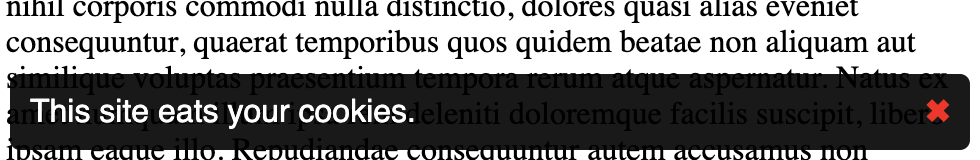
Unlike relative positioning, the element does not leave a shadow, statically-positioned box consuming space in the flow.
Absolute
An element with an absolute position is anchored against the box of its nearest non-static ancestor. This kind of positioning is often used to make child elements appear in a certain relationship to their parents.
Unlike relative positioning, the element does not leave a shadow, statically-positioned box consuming space in the flow.
We’re going to devote our next lecture to effects we can achieve with absolute positions.
Overconstraining
If all three of width, left, and height are defined, then right is ignored when the flow is left-to-right. If all three of height, top, and bottom are defined, then bottom is ignored.
For relative positions, if both top and bottom are set, bottom is ignored, regardless of whether or not height is defined. But I don’t know why.
z-index
These three non-static positions can leading to situations were elements stack on top of one another. The ordering of stacked elements is determined by the z-index property. Elements with a larger z-index appear on top of elements with a smaller z-index. If two elements have the same z-index, whichever appeared later in the document is on top.
TODO
Here’s your TODO list for next time:
- Play CSS Diner to learn some new CSS selectors that we haven’t discussed.
See you next time.

P.S. It’s time for a haiku! This one’s more personal. It’s an homage to one of sons, who uses a relative positioning scheme.
A chair’s under him
I wouldn’t say he’s sitting
There’s too much offset
P.P.S. Here’s the code we wrote together in class…
gallery.html
<!DOCTYPE html>
<html>

<head>
  <title>Gallery</title>
  <style>

/* Add your CSS here. */

body {
  margin: 0;
}

#root {
  width: 960px;
  display: flex;
  flex-direction: row;
  flex-wrap: wrap;
  margin: 0 auto;
  background-color: rgb(200, 200, 200);
  justify-content: space-evenly;
  /* align-content: center; */
  box-shadow: 0 0 10px rgb(100, 100, 100);
}

.card {
  margin: 5px;
}

.card > img {
  border: 5px solid cornflowerblue;
  border-radius: 5px;
}

  </style>
</head>

<body>
  <div id="root">
    <div class="card"><img src="https://picsum.photos/200/300?random=1"></div>
    <div class="card"><img src="https://picsum.photos/200/300?random=2"></div>
    <div class="card"><img src="https://picsum.photos/200/300?random=3"></div>
    <div class="card"><img src="https://picsum.photos/200/300?random=4"></div>
    <div class="card"><img src="https://picsum.photos/200/300?random=5"></div>
    <div class="card"><img src="https://picsum.photos/200/300?random=6"></div>
    <div class="card"><img src="https://picsum.photos/200/300?random=7"></div>
    <div class="card"><img src="https://picsum.photos/200/300?random=8"></div>
    <div class="card"><img src="https://picsum.photos/200/300?random=9"></div>
    <div class="card"><img src="https://picsum.photos/200/300?random=10"></div>
    <div class="card"><img src="https://picsum.photos/200/300?random=11"></div>
    <div class="card"><img src="https://picsum.photos/200/300?random=12"></div>
    <div class="card"><img src="https://picsum.photos/200/300?random=13"></div>
    <div class="card"><img src="https://picsum.photos/200/300?random=14"></div>
    <div class="card"><img src="https://picsum.photos/200/300?random=15"></div>
    <div class="card"><img src="https://picsum.photos/200/300?random=16"></div>
    <div class="card"><img src="https://picsum.photos/200/300?random=17"></div>
  </div>
</body>

</html>
bernie.html
<!DOCTYPE html>

<html lang="en">
  <head>
    <title>...</title>
    <style>
html, body {
  height: 100%;
}

img {
  width: 200px;
  position: relative;
}

body {
  display: flex;
  flex-direction: column;
  align-items: center;
  justify-content: center;
}

#bernie {
  /* position: static; */
  z-index: -999999999999999999999999999999999;
}

#north:hover {
  top: 200px;
}

#east:hover {
  right: 200px;
}

#south:hover {
  bottom: 200px;
}

#west:hover {
  right: -200px;
}

    </style>
  </head>

  <body>


    <img id="north" src="wig1.png">
    <div id="middle">
      <img id="west" src="wig2.png">
      <img id="bernie" src="bernie.png">
      <img id="east" src="wig4.png">
    </div>
    <img id="south" src="wig8.png">

  </body>
</html>