CS 268: Lecture 10 – Absolute Positioning and Media Queries
Dear students:
Today we’ll look at how we can use absolute positioning to achieve dropdown menus and then take our first steps into the world of responsive web design.
Absolute Position
We saw last time that an element with an absolute position is anchored against the box of its nearest non-static ancestor. This kind of positioning is often used to make child elements appear in a spatial location within or near their parents. Let’s see how we can this kind of positions to create dropdown menus for our navigation links.
This is the effect we are after:
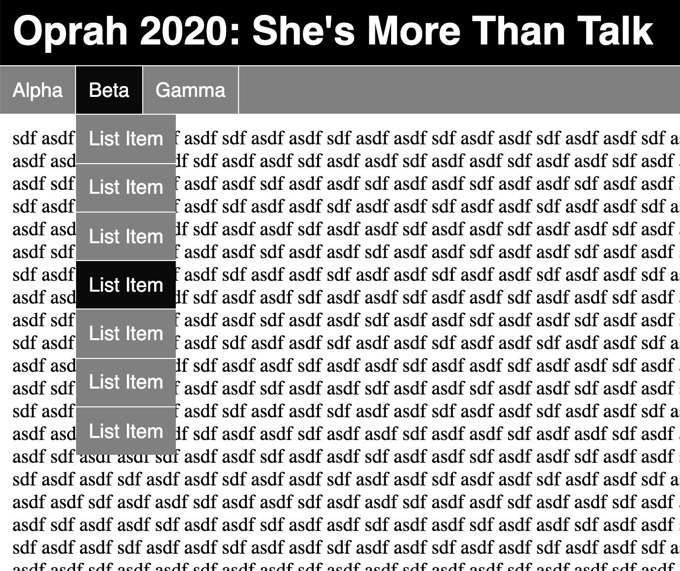
Instead of starting from scratch, we’ll build off this structure, which is similar to one of our previous activities:
<!DOCTYPE html>
<html>
<head>
  <title>...</title>
  <style>
body {
  margin: 0;
}

main {
  padding: 10px;
}

header h1 {
  margin: 0;
  padding: 10px;
  background-color: black;
  font-family: sans-serif;
  color: white;
}

.categories {
  border-top: 1px solid white;
  list-style: none;
  background-color: gray;
  color: white;
  display: flex;
  justify-content: flex-start;
  font-family: sans-serif;
  margin: 0;
  padding: 0;
}

.category {
  padding: 10px;
  border-right: 1px solid white;
}

.dropdown li:hover, .category:hover {
  background-color: rgb(10, 10, 10);
}

  </style>
</head>
<body>
  <header>
    <h1>Oprah 2020: She's More Than Talk</h1>
  </header>

  <nav>
    <ul class="categories">
      <li class="category">
        Alpha
        <ul class="dropdown">
          <li>List Item</li>
          <li>List Item</li>
          <li>List Item</li>
          <li>List Item</li>
          <li>List Item</li>
          <li>List Item</li>
          <li>List Item</li>
        </ul>
      </li>
      <li class="category">
        Beta
        <ul class="dropdown">
          <li>List Item</li>
          <li>List Item</li>
          <li>List Item</li>
          <li>List Item</li>
          <li>List Item</li>
          <li>List Item</li>
          <li>List Item</li>
        </ul>
      </li>
      <li class="category">
        Gamma
        <ul class="dropdown">
          <li>List Item</li>
          <li>List Item</li>
          <li>List Item</li>
          <li>List Item</li>
          <li>List Item</li>
          <li>List Item</li>
          <li>List Item</li>
        </ul>
      </li>
    </ul>
  </nav>

  <main>
    ...
  </main>
</body>
</html>
We first establish each category label as an anchor point with this style:
.category {
  /* ... */
  position: relative;
}
Then we style the dropdown menus, which are children of the category items, as follows:
.dropdown {
  position: absolute;
  background-color: gray;
  list-style: none;
  padding: 0;
  margin: 0;
  top: 100%;
  left: 0;
}
We anchor the top edge to be 100% below the parent’s top edge and the left edge to be aligned with the parent’s left edge.
We only want the a menu to be visible when its category is covered, so we add these rules:
.dropdown {
  /* ... */
  display: none;
}

.category:hover > .dropdown {
  display: block;
}
We apply this style to separate the menu items:
.dropdown li {
  border-top: 1px solid white;
  padding: 10px;
  margin: 0;
}
The right edge of the menus will default to match the parent’s right edge, which means each menu will have a slightly different size. We could fix the size, but that might be hard to get right in a sustainable way. Instead, we can just suppress wrapping with this style:
.dropdown li {
  /* ... */
  white-space: nowrap;
}
Activity
With exactly one neighbor, claim your task on Crowdsource. (Everyone will be assigned task 1.) Then recreate the following page:
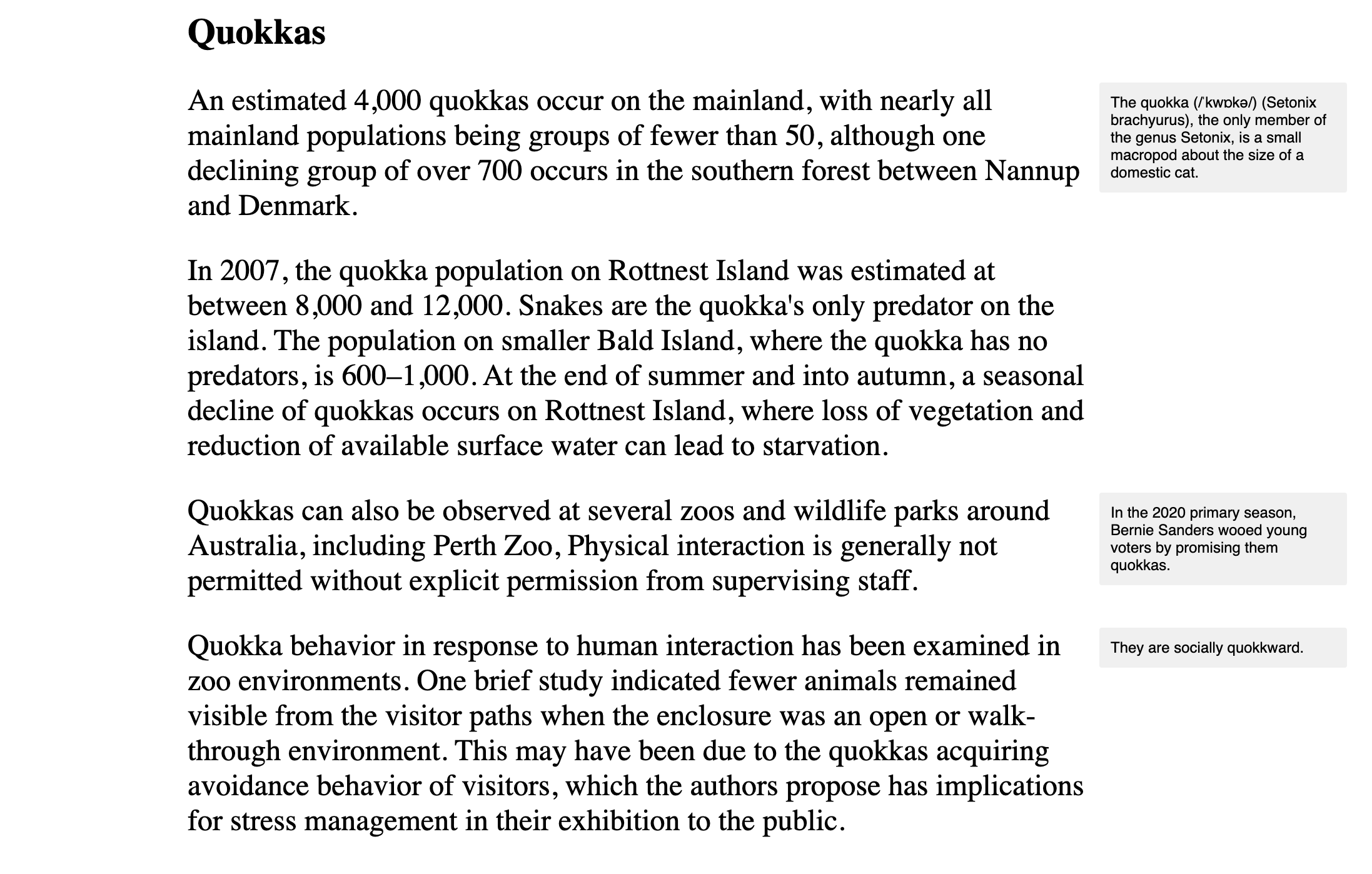
The main text is in a column that is 800 pixels wide and centered in the window. The margin notes are 200 pixels wide.
Apply styling to the following starter code to match the page above:
<!DOCTYPE html>
<html>
<head>
  <title>...</title>
  <style>

/* Add your CSS here. */

  </style>
</head>
<body>
  <div id="root">
    <h1>Quokkas</h1>
    <p>
      An estimated 4,000 quokkas occur on the mainland, with nearly all mainland populations being groups of fewer than 50, although one declining group of over 700 occurs in the southern forest between Nannup and Denmark.
      <span class="note">The quokka (/ˈkwɒkə/) (Setonix brachyurus), the only member of the genus Setonix, is a small macropod about the size of a domestic cat.</span>
    </p>
    <p>
      In 2007, the quokka population on Rottnest Island was estimated at between 8,000 and 12,000. Snakes are the quokka's only predator on the island. The population on smaller Bald Island, where the quokka has no predators, is 600–1,000. At the end of summer and into autumn,  a seasonal decline of quokkas occurs on Rottnest Island, where loss of vegetation and reduction of available surface water can lead to starvation.
    </p>
    <p>
      Quokkas can also be observed at several zoos and wildlife parks around Australia, including Perth Zoo, Physical interaction is generally not permitted without explicit permission from supervising staff.
      <span class="note">In the 2020 primary season, Bernie Sanders wooed young voters by promising them quokkas.</span>
    </p>
    <p>
      Quokka behavior in response to human interaction has been examined in zoo environments. One brief study indicated fewer animals remained visible from the visitor paths when the enclosure was an open or walk-through environment. This may have been due to the quokkas acquiring avoidance behavior of visitors, which the authors propose has implications for stress management in their exhibition to the public.
      <span class="note">In other words, they are quokkward.</span>
    </p>
  </div>
</body>
</html>
Submit your solution on Crowdsource.
Responsive Web Design
If our website faces the public, it’s likely that it will be visited by someone on a mobile device. In fact, that mobile device might be the only computer-ish thing that the person owns. They may not have the luxury of a monitor or display that has the resolution you used to design it. Don’t forget rule #52 of computer science: your user doesn’t look like you.
What will happen when we point our mobile browser to a site that assumes a desktop or laptop display? We’ll check out a few of your sites to see.
A site that is sensitive to the many environments in which in may be rendered is said to be responsive. Ideally, we want to be able to write one, insensitive HTML structure but gain the sensitivity through other means, like the styling.
There are a few tricks to making our sites readable on small screens: the meta-viewport tag and media queries. Let’s look at them both.
Meta Viewport
When a mobile browser loads a page, it looks for a tag of this form in head:
<meta name="viewport" content="width=...">
If no such tag is found, the browser assumes that the page was designed to be viewed on a desktop or laptop. It therefore sets the logical width of the viewport to a value that makes sense for those larger resolutions. At the time of this writing, this default will be somewhere in the range of 1000 pixels.
The effect of such a large width is that text and buttons will be too small to read and interact with. The user will need to scale. Once scaled, the user will likely need to scroll horizontally to read all the content. Don’t forget rule #19 of computer science: never require the user to scroll horizontally.
The standard recommendation to declare your site’s mobile readiness is to include this meta tag:
<meta name="viewport" content="width=device-width, initial-scale=1">
The browser will set the logical viewport width to match the physical device’s width. Text and buttons will be human-sized and scaling may not be necessary. Vertical scrolling may be necessary, but that’s okay.
Media Queries
The other trick to getting our content to show properly on small screens is conditional CSS. We can define rules that only get applied on small screens, for instance. The mechanism for determining characteristics of the presentation medium is called a media query. Media queries have one of these forms:
@media (CRITERIA) {
  SELECTOR {
    PROPERTY: VALUE;
  }
}
Inside the @media block we have standard CSS rulesets. But they are only applied when CRITERIA is met.
The criteria can be made up of types and features. Types include screens, print, speech, and all. Features include things like a cursor-like device that supports hovering, screen orientation, high constrast display, and screen sizes. MDN maintains a comprehensive list.
For our purposes today, we’ll keep it simple. We’ll turn the margin notes from out activity into inline asides that appear under their paragraph.
We keep the regular CSS at the top of our style to set the default values. But then we need to override these defaults with new rules.
In recent history, designers were tempted to write media queries that targeted specific devices. These days, it’s considered a better and more sustainable practice to let your content determine where the breakpoints in your media queries should occur. For example, if you expect your content to be a certain number of pixels wide by default, then you need to add a media query that targets an environment that would cut that image off and alter the presentation so it’s not cut off.
In our case, we’ll override these styles when the viewport gets too small with this media query:
@media (max-width: 1200px) {
  .note {
    /* ... */
  }
}
We use 1200 because the left margin on the body is 10 pixels, the left margin on the root needs to be 200 pixels to match the right margin, the main content is 800 pixels, the spacing between the text and the notes is 10 pixels, and the notes are 200 pixels.
Our margin notes should return to being statically positioned and should display as block elements. We set these properties and tweak the sizing and spacing with this rule:
@media (max-width: 1200px) {
  .note {
    display: block;
    position: static;
    width: auto;
    margin: 0;
    margin-top: 20px;
    font-size: 12pt;
  }
}
We’ll test our media queries in the Android emulator (starting up a server and accessing 10.0.2.2 to step out to our local machine) and using Chrome’s developer tools.
TODO
Here’s your TODO list for next time:
- Read a book or articles to learn something new about about HTML, CSS, or Javascript. Write up a response on your blog before Monday. Be sure to include a couple of paragraphs of your own text, some code examples, and links to your sources. Also, make sure that I can find this new post when I visit
http://YOUR-IP-ADDRESS:8000. Do not delete your earlier posts.
See you next time.

P.S. It’s time for a haiku!
Some are big, some small
Some screens are wide, some are tall
Gotta test ’em all
P.P.S. Here’s the code we wrote together in class…