CS 268: Lecture 11 – Media Queries and JavaScript
Dear students:
Last week we started making our web pages sensitive to their presentation environment using media queries. We continue that discussion today and formally break into a discussion of Javascript.
Media Queries
We saw last time the mechanism for expressing conditional CSS via media queries. A primary use of media queries is to support different presentations on desktop and mobile. Let’s walk through a few differences between these two presentation environments.
- Mobile sites are often viewed in portrait mode, but desktop sites will appear in landscape mode in a maximized browser window.
- Mobile sites have much less resolution than a desktop, so images usually do not appear within flowing text like they do on desktop sites. Content is organized in a strictly vertical stack. We saw this last week with our margin notes.
- Mobile sites don’t typically have a concept of mouse hovering, but desktops do.
- Fingers are bigger and less precise than cursors, meaning that mobile buttons and links need to be human-sized.
- Because the content is narrower on a mobile device and perhaps requires more scrolling to get through, we end up farther from navigation links if they are only at the top of the page. They need to be made more quickly accessible for mobile users.
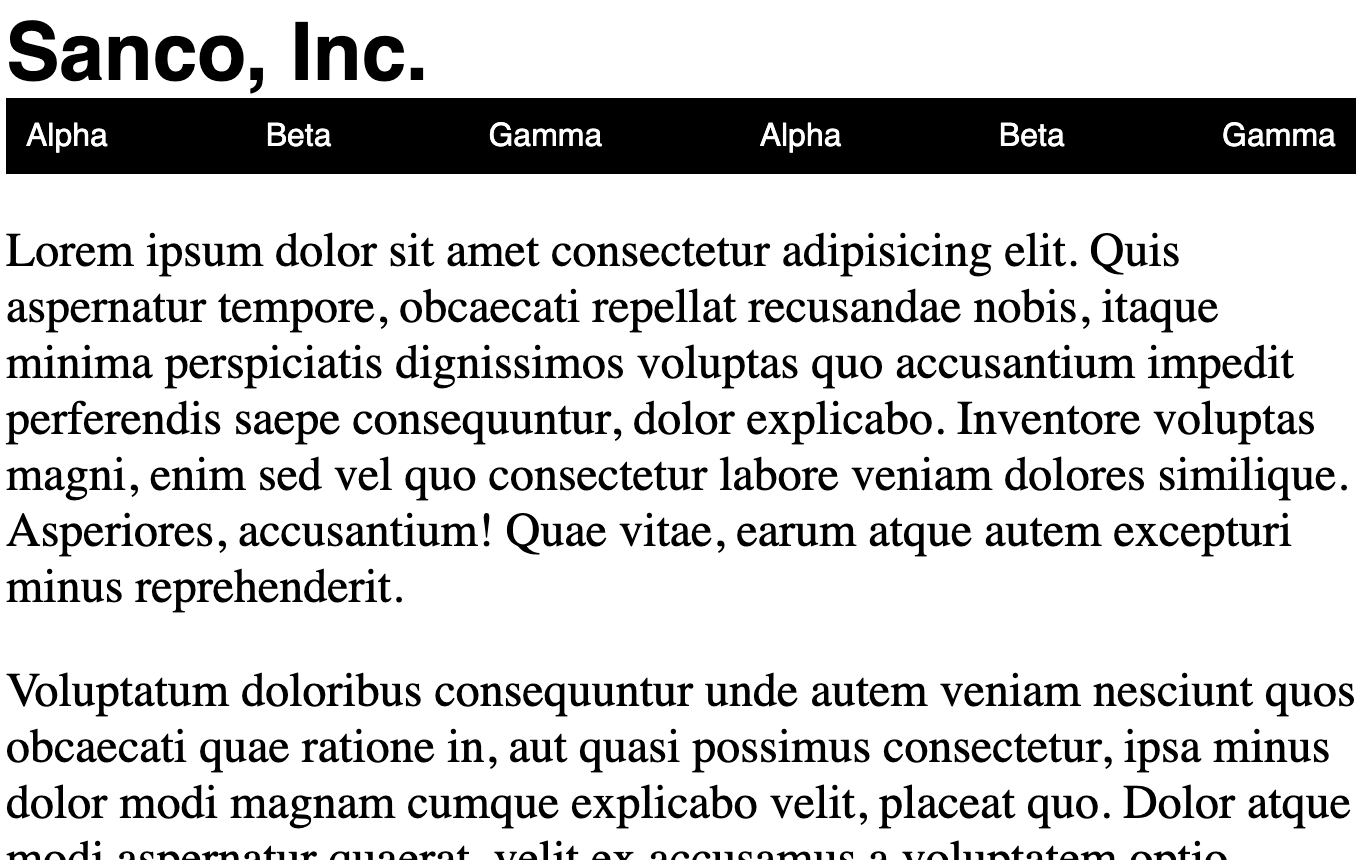
Let’s examine the last of these points by creating a page with two different presentations. Here’s the desktop version:
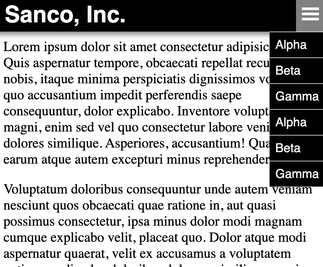
And here’s the mobile version:
We’ll start using this core HTML structure:
<!DOCTYPE html>
<html>
<head>
  <title>...</title>
  <style>

p {
  font-size: 18pt;
}

h1 {
  font-size: 40px;
  font-family: sans-serif;
  margin: 0;
}

  </style>
  <meta name="viewport" content="width=device-width,initial-scale=1">
</head>
<body>
  <header>
    <h1>Sanco, Inc.</h1>

    <div id="menu-button">
      <svg viewBox="0 0 100 80" width="30" height="30">
        <rect fill="white" width="100" height="15"></rect>
        <rect fill="white" y="30" width="100" height="15"></rect>
        <rect fill="white" y="60" width="100" height="15"></rect>
      </svg>
    </div>

    <nav id="navigation">
      <ul>
        <li>Alpha</li>
        <li>Beta</li>
        <li>Gamma</li>
        <li>Alpha</li>
        <li>Beta</li>
        <li>Gamma</li>
      </ul>
    </nav>
  </header>

  <main>
    <p>Lorem ipsum dolor sit amet consectetur adipisicing elit. Quis aspernatur tempore, obcaecati repellat recusandae nobis, itaque minima perspiciatis dignissimos voluptas quo accusantium impedit perferendis saepe consequuntur, dolor explicabo. Inventore voluptas magni, enim sed vel quo consectetur labore veniam dolores similique. Asperiores, accusantium! Quae vitae, earum atque autem excepturi minus reprehenderit.</p>
    <p>Voluptatum doloribus consequuntur unde autem veniam nesciunt quos obcaecati quae ratione in, aut quasi possimus consectetur, ipsa minus dolor modi magnam cumque explicabo velit, placeat quo. Dolor atque modi aspernatur quaerat, velit ex accusamus a voluptatem optio, repudiandae doloribus dolorum similique sequi itaque expedita laborum beatae quasi voluptates distinctio esse?</p>
    <p>Illo saepe, repellat distinctio nisi quae culpa quod facilis quidem quis debitis quisquam beatae nostrum quia mollitia ipsa magni nihil modi vitae accusamus. Dolore animi nisi accusantium magni! Neque itaque atque, omnis dolore nam animi, asperiores, nemo in dignissimos repellendus nulla beatae necessitatibus a quibusdam non quisquam nostrum ipsa aliquid!</p>
    <p>Voluptatibus quibusdam debitis provident doloremque, cupiditate nostrum atque, laborum consequuntur est facere reiciendis hic aspernatur quidem laboriosam et soluta asperiores odio, tenetur blanditiis? Praesentium aliquam adipisci expedita ut? Enim ipsam quam veritatis, ut at odit commodi id repellendus culpa inventore obcaecati reprehenderit, fugit iste laboriosam quos! Quam odio in nobis?</p>
    <p>Quisquam cum eveniet dolorem, perferendis culpa reprehenderit eligendi et nam porro veritatis neque repellendus. Iure sunt veritatis, impedit ipsa tenetur recusandae, soluta reiciendis illo harum dolor dolores sint, labore nesciunt ipsum error quisquam iste libero dolorem. Nemo nobis aliquid voluptate, recusandae error deleniti voluptas minima quibusdam accusantium? Fuga, quos dolorem!</p>
    <p>Fugit, debitis minus. Modi ut, iusto deserunt recusandae ullam quibusdam reprehenderit fugit totam repellendus enim perferendis animi optio dolorem laborum eligendi sed, vitae praesentium consequatur pariatur tenetur laudantium? Tempore provident quod molestias quasi. Recusandae id asperiores vel voluptas, dolore, saepe perferendis fugiat harum at, tempora voluptates ad magni debitis sint!</p>
    <p>Nam repellendus, quae amet nemo vel ab autem aliquam harum dignissimos dolorem eius pariatur perferendis ex perspiciatis! Neque, ipsam culpa! Numquam tempore illum consequuntur perferendis nihil praesentium animi officiis repellat sed doloribus temporibus similique aspernatur non corrupti magni, voluptatem vel quia eveniet veritatis, dolor pariatur ipsum odit molestias culpa? Asperiores.</p>
    <p>Corporis dolorum, facilis optio quibusdam, quam, tempora distinctio tempore ex voluptatibus rem asperiores ratione voluptates? Possimus sit consequatur in voluptate repudiandae magnam obcaecati animi. Laborum repudiandae inventore, tenetur nam praesentium impedit earum, accusantium expedita molestiae facilis veritatis odio officia ea consequatur aliquam recusandae dolore asperiores voluptatum? Quos eius et placeat.</p>
    <p>Perferendis, eius eum voluptatibus explicabo dicta aperiam nam possimus quae dolor aut quisquam ut beatae aspernatur eos sint. Corrupti maiores molestiae neque qui quae enim. Ea eos ab debitis aperiam quas? Nobis esse a culpa repudiandae consectetur, quae non. Fugiat ea facere impedit id incidunt enim voluptas ullam distinctio doloribus!</p>
    <p>Accusamus vitae iusto quidem culpa unde, totam dignissimos perferendis vel! Placeat ratione laborum sunt blanditiis reprehenderit culpa, illo fugit quisquam deserunt. Recusandae, modi quia ducimus repellendus maxime pariatur deserunt neque, ipsa sequi a id. Impedit rem officiis voluptate hic veritatis, voluptatibus voluptatem incidunt eaque eius, deleniti aliquam, totam quod doloremque.</p>
  </main>
</body>
</html>
To get the desktop version up and running, we apply the concepts we’ve already discussed, namely tweaking the box properties and laying out the links using Flexbox. We end up with this CSS:
nav > ul {
  margin: 0;
  padding: 0;
  list-style: none;
  display: flex;
  flex-direction: row;
  justify-content: space-between;
  background-color: black;
}

nav > ul > li {
  color: white;
  font-family: sans-serif;
  padding: 10px;
}

nav > ul > li:hover {
  background-color: gray;
}

nav > ul > li:active, .active {
  background-color: rgb(180, 150, 0);
}

#menu-button {
  display: none;
}
Some web designers advocate that you set the default rules for mobile instead of for desktop. Motivating this mobile-first strategy is the idea that mobile is a better safety net than desktop. Just in case we never get to the desktop design or in case we have errors in our HTML or CSS somewhere, we at least have a baseline presentation that works on both mobile and desktop. A desktop design does not often work on mobile.
To get the mobile version up and running, we need to do these things:
- Make the
headerstick to the top of the window no matter how far we scroll. We used fixed positioning for that. - Display the hamburger icon menu at the right side of the header and have it display a vertical stack of the navigation links right below the header.
- Drop
maindown a bit so that its top doesn’t get obscured by the now-fixed header.
We can accomplish all this with just a wee bit of CSS:
#menu-button {
  display: none;
  padding: 10px;
  align-self: stretch;

  align-items: center;
  justify-content: center;
}

@media (max-width: 600px) {
  header {
    background-color: black;
    box-sizing: border-box;
    height: 60px;

    box-shadow: 0 -15px 10px 20px gray;

    position: fixed;
    left: 0;
    right: 0;
    top: 0;

    display: flex;
    flex-direction: row;
    justify-content: space-between;
    align-items: center;
  }

  h1 {
    padding: 10px;
    color: white;
  }

  #menu-button {
    display: flex;
  }

  nav {
    position: absolute;
    right: 0;
    top: 100%;
    display: none;
  }

  nav.open {
    display: flex;
  }

  nav > ul {
    flex-direction: column;
  }

  nav > ul > li {
    background-color: black;
    border-top: 1px solid white;
    color: white;
  }

  main {
    padding-top: 40px;
  }
}
We cannot use :hover to provide interaction feedback on a mobile device. But we can use :active, which is a pseudoclass that is applied when we are actively pressing on something.
When we let get of the menu button, we want it to stay looking like it is still active, and we also want the menu to appear below it. We can achieve this by dynamically adding classes to our elements with this JavaScript event handling code:
const menuButton = document.getElementById('menu-button');
const navigation = document.getElementById('navigation');

menuButton.addEventListener('click', e => {
  menuButton.classList.toggle('active');
  navigation.classList.toggle('open');
});
To support closing the menu by clicking elsewhere, we can add this general click handler to the entire document:
document.addEventListener('click', () => {
  menuButton.classList.remove('active');
  navigation.classList.remove('open');
});
But this undermines our original handler because events bubble up the document tree. The click event first gets process by the button handler and then by the document handler. We can stop this bubbling with this extra call on the event:
menuButton.addEventListener('click', e => {
  /* ... */
  e.stopPropagation();
});
You may be tempted to tweak the styles directly in the event handlers, but these explicit changes will override the values from the stylesheet and perhaps interfere with your media queries.
Activity
With exactly one neighbor, claim your task on Crowdsource. (Everyone will be assigned task 1.) Then recreate the following page:
Note that there are two “breakpoints” at which the presentation changes. Combined with the default styling, this makes for a total of three presentation modes.
Apply styling to the following starter code to match the behavior shown in the video:
<!DOCTYPE html>
<html>
<head>
  <title>...</title>
  <style>

/* Add your CSS here. */

  </style>
</head>
<body>
  <nav>
    <ul id="navigation-links">
      <li>Alpha</li>
      <li>Beta</li>
      <li>Gamma</li>
      <li>Alpha</li>
      <li>Beta</li>
      <li>Gamma</li>
      <li>Alpha</li>
      <li>Beta</li>
      <li>Gamma</li>
    </ul>
  </nav>
</body>
</html>
Submit your solution on Crowdsource.
JavaScript
HTML by itself is inert. It doesn’t do anything interesting on its own. Therefore, a companion language was invented. That language is called JavaScript. HTML files can include JavaScript much like it includes CSS.
The JavaScript is executed by the client browser, not by the server. Since the code is being run on your local machine, there’s a possibility that nasty things could be done when you visit pages from the dark side of the web. To prevent this, browsers execute the JavaScript in a sandboxed environment that generally has no access to the file system or other personal data. All it can do is generate and modify HTML, respond to events that the browser senses, read and write a small amount of data in the form of cookies and local key-value storage, trigger HTTP requests, and perform a limited number of actions that the browser makes available, like change the URL or copy data to the clipboard. We will look at just a few of these features today.
Generating HTML
For example, we can generate a list of numbers with this JavaScript loop embedded directly in HTML:
<ul>
  <script>

for (let i = 0; i < 10; i += 1) {
  document.write(`<li>${i}</li>`);
}

  </script>
</ul>
The code executes immediately when embedded like this. If we wanted two such lists, we’d factor the JavaScript out to an external file—which is a good practice—and include it with this script tag:
<script src="list.js"></script>
<script src="list.js"></script>
<script src="list.js"></script>
This code is still executed immediately even when the JavaScript is in an external file.
Event Handling
It’s not often that we generate HTML directly like we did in the preceding example. More often we write code to handle events that are triggered by the user interacting with our page.
Suppose we have a form for getting a 7-digit number for the user. We might create this HTML structure:
<!DOCTYPE html>
<html>
<head>
  <title>...</title>
</head>
<body>
  <label for="number-input">Enter a 7-digit number:</label>
  <input id="number-input" type="text">
  <input id="submit-button" type="button" value="Submit">
</body>
</html>
Let’s sanitize the user data. We’ll disable the submit button and only enable it when we get exactly seven digits using this JavaScript:
const submitButton = document.getElementById('submit-button');
const numberInput = document.getElementById('number-input');

submitButton.disabled = true;

numberInput.addEventListener('input', () => {
  if (numberInput.value.match(/^\d{7}$/)) {
    submitButton.disabled = false;
  } else {
    submitButton.disabled = true;
  }
});
Let’s include this script in the HTML file with this tag in head:
<head>
  <script src="form.js"></script>
</head>
Our script fails. That’s because the elements the script grabs handles to do not exist at the time the script is loaded. We either have to place the script tag at the bottom of the page, or we must add the defer attribute to schedule it to be executed after the HTML is parsed. The defer attribute feels like better organization. We use it like this:
<head>
  <script defer src="form.js"></script>
</head>
This works nicely, but be warned. Suppose we were going to send this data up to a server somewhere and maybe throw it into a database. Sanitizing the user input only on the client is not enough. Because the browser lets us enter the JavaScript sandbox, users can programmatically modify the page. We can execute our own code to free up the submit button. You must always verify that the data is valid on the server.
TODO
Here’s your TODO list for next time:
- If you are feeling ill, stay home. But tell me so ahead of time in a direct message on Slack.
- Read a book or articles to learn something new about about HTML, CSS, or Javascript. Look for something of higher quality than W3 Schools. Write up a response on your blog before Monday. Be sure to include a couple of paragraphs of your own text, some code examples, and links to your sources. Also, make sure that I can find this new post when I visit
http://YOUR-IP-ADDRESS:8000. Do not delete your earlier posts. - Check your project 1 against the grading rubric.
- Make sure I have the following or your project 1 grade will suffer terribly:
- the URL of your Git project (along with access if your repository is private)
- the URL of your project (which is served on port 8443)
See you next time.

P.S. It’s time for a haiku!
HTML, CSS, and JavaScript
We put up the tree
Trimmed with ornaments and lights
Now for the chainsaw
P.P.S. Here’s the code we wrote together in class…