CS 318 Lab 10 – Absolute and Relative Positioning
Dear students,
There’s immense power in the position property. It is your vehicle for anchoring elements relative to another, animating them on user interactions, providing a heads-up display that is always on screen, and achieving a fluid layout that can bend and flex with the browser window. Today we will explore absolute and relative positioning.
Let’s introduce these with a short example from last night’s Oscars. We’d like to make a page that shows a readable blurb of text, but when the viewer mouses over the movie name, an image of the movie’s poster pops up. Here’s our first go:
Best Picture went to Moonlight<img src="http://t3.gstatic.com/images?q=tbn:ANd9GcT53B_Wizqekgv5U9fetXZc_7FmMFzp5MpeEodcyTOiugrjV7iP" width="200">.
Best Supporting Actress went to Viola Davis in Fences<img src="http://t0.gstatic.com/images?q=tbn:ANd9GcRt-j2EYdJQHgR4kf077h3lHPz_h6-JHBIDYv7v-sB1x5lD6rj6" width="200">.
Let’s first get the images out the flow of text. We’ll add them into a class called popup:
Best Picture went to Moonlight<img src="http://t3.gstatic.com/images?q=tbn:ANd9GcT53B_Wizqekgv5U9fetXZc_7FmMFzp5MpeEodcyTOiugrjV7iP" width="200" class="popup">.
Best Supporting Actress went to Viola Davis in Fences<img src="http://t0.gstatic.com/images?q=tbn:ANd9GcRt-j2EYdJQHgR4kf077h3lHPz_h6-JHBIDYv7v-sB1x5lD6rj6" width="200" class="popup">.
Then let’s add absolute positioning to bust them free:
.popup {
  position: absolute;
}
Does this put them where we want them? No. Absolute positioning anchors an element against in closest ancestor that has non-static positioning. For us, that’s body. We want to anchor it against the movie title. We need an element for the title, which we’ll drop into class movie:
Best Picture went to <span class="movie">Moonlight<img src="http://t3.gstatic.com/images?q=tbn:ANd9GcT53B_Wizqekgv5U9fetXZc_7FmMFzp5MpeEodcyTOiugrjV7iP" width="200" class="popup"></span>.
Best Supporting Actress went to Viola Davis in <span class="movie">Fences<img src="http://t0.gstatic.com/images?q=tbn:ANd9GcRt-j2EYdJQHgR4kf077h3lHPz_h6-JHBIDYv7v-sB1x5lD6rj6" width="200" class="popup"></span>.
We also need to give it non-static positioning. We don’t want it to be bust free from its parent element as is done with absolute, so we use the milder relative:
.movie {
  position: relative;
}
Since we don’t set top, right, bottom, or left, the movie span just appears in its usually location.
How do the movie posters look now? They clobber the text. Let’s tweak popup to shove them down below the text:
.popup {
  position: absolute;
  top: 18pt;
  left: 0;
}
Better? Let’s do one more thing. Let’s hide the posters, but in a bit we’ll display them when the viewer hovers over the text. Let’s also make the text look like a link:
.movie {
  position: relative;
  color: blue;
  text-decoration: underline:
}

.popup {
  position: absolute;
  top: 18pt;
  left: 0;
  visibility: hidden;
}
How do we handle the mouse hovering? We can use the hover pseudoselector:
.movie:hover {
  color: red;
}
Then we can use a descendent selector to toggle the visibility:
.movie:hover .popup {
  visibility: visible;
}
Here’s your TODO list for next time:
- Read chapter 7 in your book. On a quarter sheet, share 2-3 questions or observations from your reading. Consider having one of them be a layout for one of your project’s pages. Identify the main structural
divs and theirfloat,clear, orpositionvalues.
See you then!

Lab
First create a lab10 directory. Add a partners.html and include your first names and last initials.
Bulletin Board
Create a bulletin board that shows three Polaroid photos of animals:
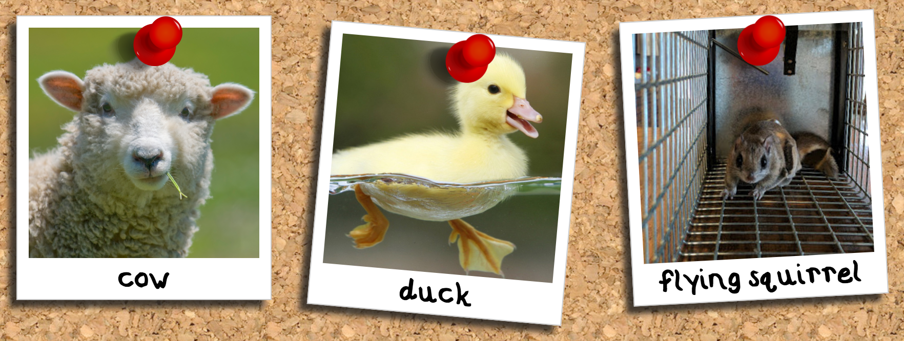
The Polaroid effect is not in the original images, but we’ll use CSS to add it in. Here’s your checklist:
- Find and download three animal images. Use an image editor to crop them square.
- Design your page in
board.html. - Make all elements use the
border-boxsizing policy with this CSS rule:Consider this an automatic first step in all your CSS endeavors.* { box-sizing: border-box; }
- Add in a repeating background of a cork bulletin board. Like this one.
- Add in three
divs with classphoto. - Give each
photothree child elements: an animalimg, a pushpinimg, and adivof classlabelcontaining the animal’s name. - Manipulate the photos’ spatial properties to produce a Polaroid-like white frame. Notice the asymmetry. Size all images to be identical. Place them all on the same line, but space them apart from one another.
- Resize the pushpin image to a reasonable scale using CSS.
- Position the pushpin at the top center of each photo. Use
absolutepositioning, which anchors an element against its closest non-staticparent element. So, makephotonon-static—userelativepositioning instead. Then, anchor the image’sleft,right, andtopto 0 units away from the parent. The image should appear in the upper-left. Center it by setting the left and right margins toauto. - Style the animal’s name to make it look like it was written in permanent marker. Search the internet for “free Sharpie fonts”, download one, and move it to your
lab10directory. Declare this new font in your CSS with@font-face:Replace@font-face { font-family: Marker; src: url(filename.ttf); }
filename.ttfwith the actual name of your font file. Then stylelabelto use this font withfont-family: Marker. - Position the
labels usingabsolutepositioning so that they are centered within the bottom strip of the Polaroid frame. Pin them to the left, right, and bottom boundaries of their parents. Set the font size to be a little smaller than the height of the strip. We usually useptunits for sizing text, butpxunits work better here because you probably used apxvalue to size the frame. Tweak the bottom offset to vertically center the label. - Add a drop shadow to the photos. Place the light source at the upper-left to match the lighting of the pushpin.
- Perturb the photos so they aren’t so uniform. The photos should already have
relativepositioning. Give each a unique ID. Then individually adjust theirtopandleftvalues to offset them a bit from their gridded location. Rotate them using thetransformproperty:transform: rotate(5deg);
Staff
Create a page that shows a staff listing like this:
Note how when the mouse hovers over a photo, it depresses. We can do that with CSS!
Here’s your checklist:
- Locate a collection of four headshots from an organization of your choosing. There’s probably no need to download the images. Just copy out the URLs.
- To turn the photo into a circular cutout, we’ll need the image to be in the background rather than as an
imgelement. Create a singledivof classphotoand with a unique ID, and set its background image to one of your headshots. - Arrange
photoas an inline block. - Size
phototo be 200×200 pixels. Set the size of the background image to match. You could use200pxas the image size, but if you resizephotolater, you’ll need to also update the background size to keep it in sync. So, use a relative measure instead:100%. - Produce the circular cropping using
border-radius. Again,100pxwould do the job, but we’d like to avoid repeating these numbers. What percentage should you use? - Add the remaining three headshots. Arrange the photos in 2×2 grid of
divs. Space them apart. - Add a drop shadow to
photo. Make it light and fuzzy, as we will make it crisper in the next step when the image is hovered over to give a buttonish feel. - “Push” the image in when the mouse hovers over it. For this, we’ll use a CSS pseudoselector: This lets us apply rules to the
.photo:hover {

}
photoclass that take effect only when the mouse hovers over it. What rules do we want to affect? Let’s first make the shadow darker, smaller, and less fuzzy, as it would appear if the picture was pushed closer to the page. - The shadow isn’t enough to feel like we’re pushing the image in. Let’s also offset the image a little to the right and down. First, give
photorelative positioning. Then in thehoverrule, perturb itstopandleftoffsets a bit. - Now let’s add names. Nest
divs inside each of thephotos, give them classname, and set their content to the people’s names. Increase the font size, make the font sans serif, set the color to something light, and add a darker text shadow to add contrast. - To layer the names above the images, give them absolute positioning. Anchor them to the left, right, and bottom boundaries of their parents. Offset the bottom so that the name straddles the image’s frame. Center the text horizontally.