CS 318 Lab 11 – Two-column Layout
Dear students,
Today we visit the canonical two-column layout. We’ll use the float property to allow other content to flow around it. We’ll do a quick example together of adding drop caps to a page.
Suppose we have this paragraph:
A writer—and, I believe, generally all persons—must think that whatever happens to him or her is a resource. All things have been given to us for a purpose, and an artist must feel this more intensely. All that happens to us, including our humiliations, our misfortunes, our embarrassments, all is given to us as raw material, as clay, so that we may shape our art.
Let’s set apart the initial letter by putting it in its own span:
<span class="dropcap">A</span> writer—and, I believe, generally all persons—must think that whatever happens to him or her is a resource. All things have been given to us for a purpose, and an artist must feel this more intensely. All that happens to us, including our humiliations, our misfortunes, our embarrassments, all is given to us as raw material, as clay, so that we may shape our art.
Then we can make it really big and colorize it in CSS:
.dropcap {
  font-size: 52pt;
  color: hsl(350, 50%, 50%);
}
But there’s no flowing of content around our really big letter. Let’s add some floating and tweak the line height to make it look aesthetically balanced:
.dropcap {
  font-size: 52pt;
  color: hsl(350, 50%, 50%);
  float: left;
  line-height: 0.75;
  padding-right: 5px;
}
And there we have it!
Here’s your TODO list for next time:
- Watch All About Floats and read the accompanying article. On a quarter sheet, define in your own words two hazards of floats: collapsing and pushdown. In addition, describe how one might fix these issues.
See you then!

Lab
First create a lab11 directory. Add a partners.html and include your first names and last initials.
Pizza Place
Your task in this lab is to make a website for a pizza place. It consists of three pages: a home page, a menu, and an embedded map. All will share the same general layout, with only the content in the main element changing.
Home
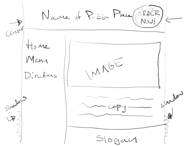
In home.html and pizza.css, create a page that looks like this:

Follow this checklist:
- Use
header,nav,main, andfooterto structure your page, with each element tightly interlocking with its neighbors. Give each a background color in a warm color theme. Pizza begs for yellows, oranges, and reds. Considering finding a theme on Adobe Color CC or a similar service. - Ensure that each box is adequately padded. No text should be jammed up against an edge of its container.
- Fix the width of the body to 600 pixels and center it within the window. Add a subtle shadow to both sides by use 0 for both the horizontal and vertical offsets but a non-zero blur radius.
- Provide links to
home.html,menu.html, anddirections.htmlin thenavelement. - Use a
ulfor the navigation links. Remove the bullets and underlines. - Arrange the page such that the
navelement floats left and the main’s left margin is inset by the width ofnav. - Use background colors to make it appear that the left column stretches all the way down to the footer, though in reality the
navwill be much shorter than the main content and footer. - Add a
divwith fixed positioning whose background is a pizza. (Perhaps this one?) Adjust the width and height of thedivand background image to consume just a small portion of the page. Make this pizza always appear in the top-right corner of the browser window, even if the viewer has scrolled down. Test this by adding dummy text to fill up your page and shrinking your browser window so the scrollbars appear. - On the top of this pizza put a link with the label
ORDER NOW!. Color and shadow it to make it readable. - Horizontally and vertically center the
ORDER NOW!text on the pizza. Vertical centering is a major pain in CSS. Here’s one way to do it. Embed the text within a seconddiv, this one withabsolutepositioning. Anchor it against the center of its parent by settingleftandtopto 50%. This will put the upper left corner of the text at the center. Center it by addingtransform: translate(-50%, -50%)to shift it back left and up halfway.
Menu
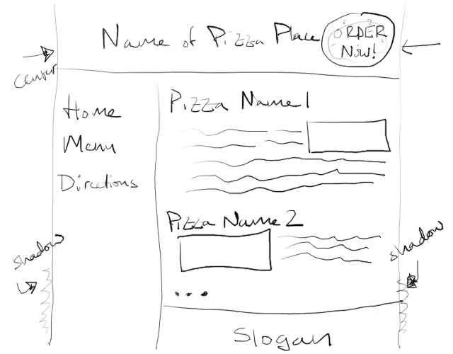
In menu.html, add a menu whose text flows around images of the various pizzas that can be ordered at your restaurant. Match this general layout:

- Use the same overall structure as you did in
home.html. But don’t create a new CSS file. Just usepizza.css. That way you can make changes to all pages in your site at once. - Include at least three types of pizza, each with at least three elements: a heading identifying the name of the pizza, a paragraph of text describing the pizza, and an image showing the pizza.
- Embed the image within the paragraph of text. As you advance through pizza types, alternate between floating left and floating right.
- Clear one pizza type before advancing to the next.
Directions
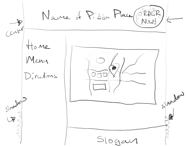
In directions.html, add a map that your viewers can use to locate your business. Matching this general layout:

- Provide an embedded map to your business using an
iframe. Find a real business on Google Maps or some other mapping service. Find the Share button, and look for an option to embed a map. Copy out theiframecode and paste into your HTML file.iframesare a means of nesting a completely different website inside your page.