CS 318 Lab 19 – Reform
Dear students,
Today we continue to explore forms. Many of you in this class will be professional communicators. Forms are kind of a big deal to you. Books don’t have them. Nor do radio and television. But our websites do. What power! Forms are a doorway; they make the web a two-way street. Your words go out, and their words come back.
Doorway might not be a good term. Funnel might be a better term. For other humans to fit themselves into your system, they must contort themselves into the shape imposed on them by your form. If you require a first name, middle name, and last name, you are assuming that all humans have this amount of names. If you ask for a 5-digit ZIP code, you are assuming that all humans live in the United States. If you allow only ten characters for a first name, you are microagressing.
If you find yourself designing forms in the future, please be a sensitive person. Do not pigeonhole your users into being people just like you.
There’s a lot of really fascinating differences between people, things that aren’t even contentious! Like our favorite flavor of ice cream. Speaking of, let’s jump into our lab activities for the day.
Here’s your TODO list:
- Read Website Forms Usability: Top 10 Recommendations, including the referenced articles Placeholders in Form Fields Are Harmful and Form Design Quick Fix: Group Form Elements Effectively Using White Space. The Nielsen Norman Group does a great job of studying our clever designs and discovering that they aren’t as good as we think. They don’t recommend some of the designs we’ve used this semester (dropdown menus, pagers). For a participation point, find a form online somewhere that violates one or more of the best practices you’ve been reading about (or others that you feel need to be recognized). Share a link to it on Piazza under folder
failsand describe your criticism in a sentence or two. Make sure we can access it without an account. Use sites that weren’t mentioned in your readings.
See you next time!

Lab
First create a lab19 directory. Add a partners.html and include your first names and last initials.
Contact
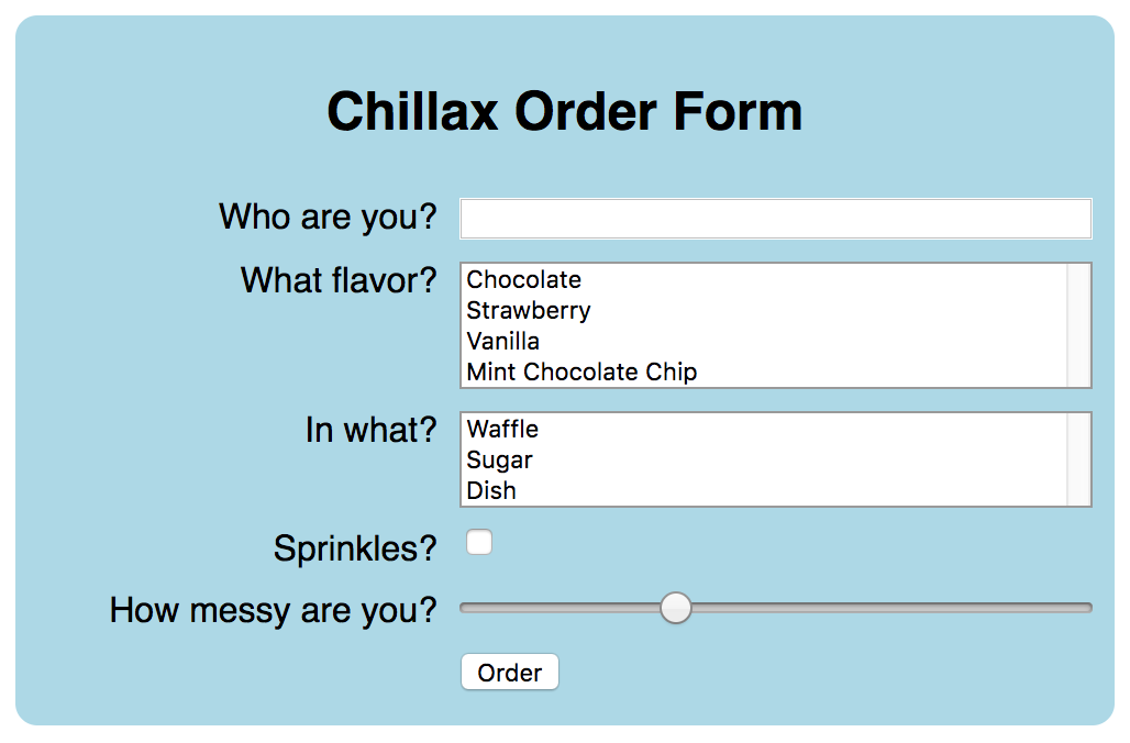
Create in icecream.html a form that looks like this:

Observe the following requirements:
- Match alignment and relative sizes as closely as possible. Feel free to switch up the options.
- In the last lab, we used
text-align: rightto push everything to the right. That won’t work here, as neither the checkbox or button are right-aligned. See that strong line running down between the labels and the elements? We want to align to that. Make it happen through this standard form-styling idiom:- Give all elements in the left “column” the same width, whether pixels or percentage points or something else.
- Have all elements float left.
- Have all elements in the left column clear any previous floats. This will force the form into rows.
- Use
selectfor the lists. Consult MDN to see how to make it display multiple options. - Use a
rangeinput for the slider. (This input helps the server determine how many napkins to provide.) Limit it to the range [0, 3]. - Have the form submit to your email address using a third-party service. (Be prepared to show your instructor or teaching assistant a submission email.)
Quiz
Create in quiz.html a quiz on a subject matter of your choosing. Observe these requirements:
- Use an ordered list to organize the questions.
- Include at least one single-answer multiple-choice question.
- Include at least one multiple-answer multiple-choice question.
- Include at least one fill-in-the-blank question.
- Include at least one essay question.
- Include at least one true-false question.
- Have the form submit to your email address using a third-party service. (Be prepared to show your instructor or teaching assistant a submission email.)