CS 318: Lab 8 – Horizontal Alignment and Gradients
Dear students,
Today, we will continue to explore the box model—because we need to. The vast majority of our difficulties with designing for the web will involve alignment and positioning.
Suppose you want to horizontally center an element. What must be true?
- It must be a block element. Centering doesn’t make sense for phrase elements.
- The space to the left must be equal to the space on the right.
We can achieve statement 1 by using a div, p, or some other block element. In other cases, we can set the display property to block. We can achieve statement 2 by setting the left and right margins. Here we set them horizontal margin to a fixed number of pixels:
div {
  margin-left: 10px;
  margin-right: 10px;
}
I wish there was a way in CSS to collapse these two properties together. There is the short form, but that requires us to also specify the vertical margin, and I don’t always want to re-specify that. I wish they had a symbolic keep or current value—or a margin-horizontal property.
If we resize the page, we see that we’re always fixed amount of pixels away from the browser’s edge. We could also use percentages:
div {
  margin-left: 10%;
  margin-right: 10%;
}
In both these cases, the child element is sized according to its parent. What if the child knows its size on its own?
div {
  width: 200px;
  margin-left: 10%;
  margin-right: 10%;
}
The div is no longer centered. At this point I we need to adjust our notion of what a margin is. A margin is the minimum space that must appear around an element, separating it from its peers and parent. If an element’s width is unspecified, then margin will be an exact measurement as the width is set to fill up the available space. But if width is specified, there may be more space around the element than just the margin.
So, centering children that have sized themselves is tricky. What we need is to figure out how much space is available, subtract away the child’s width, and split what’s left between the margins. We can do that with the auto keyword. If we assign it to the left margin, we get right alignment:
div {
  width: 200px;
  margin-left: auto;
}
If we assign auto to the right margin, we get right alignment. If we assign it to both, we get centering:
div {
  width: 200px;
  margin-left: auto;
  margin-right: auto;
}
We’ll also add some colorful flavor through gradients. Gradients have some nice properties:
- They eliminate the flatness of solid background colors.
- They automatically scale to fill the background of an element.
- Unlike images, they are generated by the browser. They require no expensive downloads.
Let’s see an example:
#flag {
  background-image: linear-gradient(to bottom, black, red, yellow);
}
Here’s your TODO list for next time:
- Read CSS Positioning: A Comprehensive Look. Complete all 25 steps of Codecademy’s CSS Positioning module. (Be sure to regularly check your result in fullscreen to see the layout in a normally-sized window. Also, not all the directions seem to produce a sane layout—specifically those regarding the navigation bar. But the interactive exercise still has value.) On a quarter sheet, write down 2 questions or observations inspired by your reading and interacting. Also, provide your own definitions for each of the four possible values of
position. - Be sure to get your WordPress posts made before March 1.
See you then!

Lab
We’ve got a few goals for this lab:
- Gain more experience with the various box model properties and their interactions with each other.
- Align block elements in the left, right, and center of the page.
Our two exercises include staging a debate between two parties and designing a page to celebrate someone’s hometown.
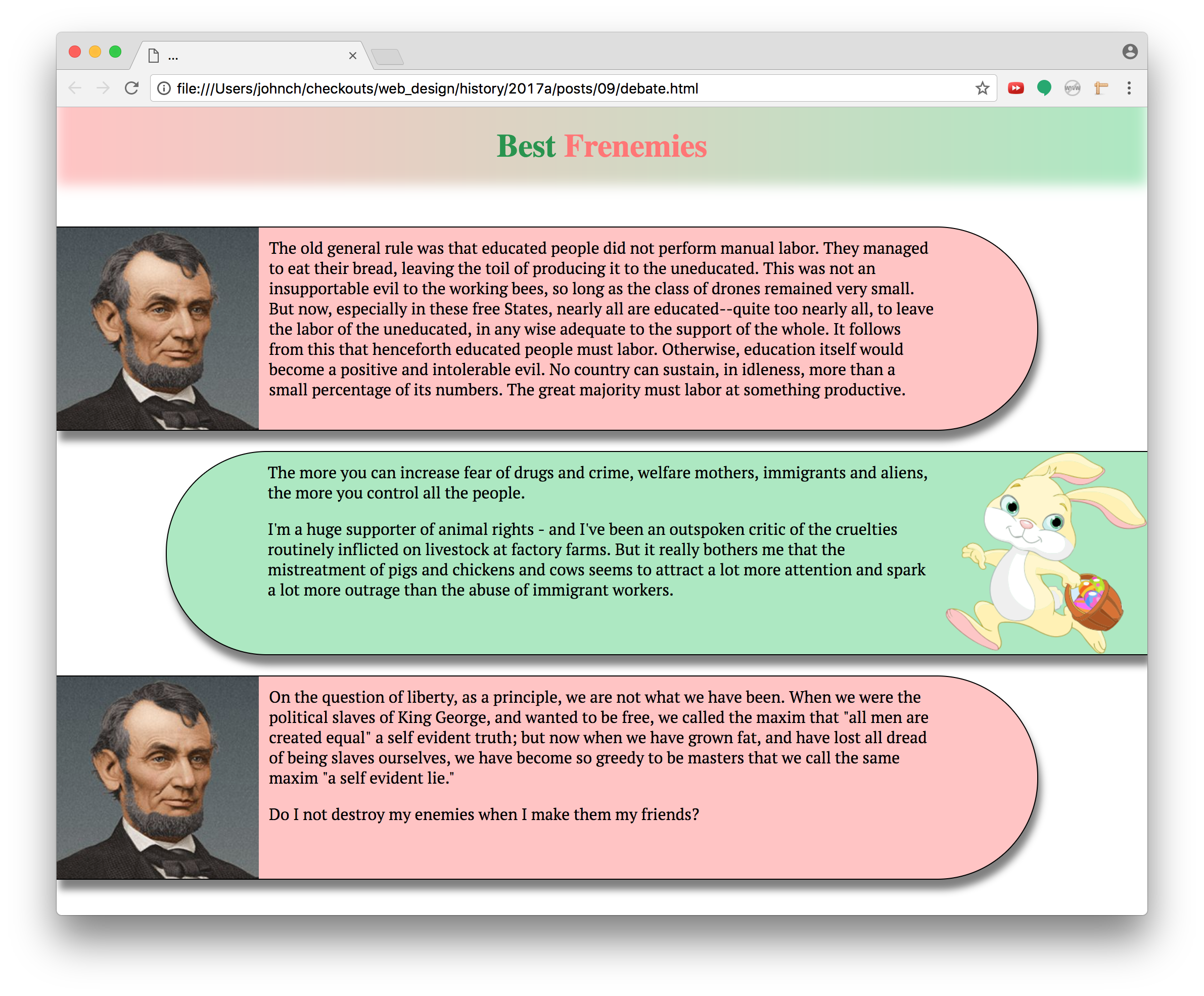
Debate
Create a “debate” between two individuals that looks like this:

Here’s your checklist:
- Set the
box-sizingproperty of all elements toborder-box. - Use
divs to create an alternating sequence of blurbs filled with the debaters’ statements. Random text is fine. - Assign each
divto classblurb. Assign the left debater’s blurbs also to classleft. Assign the right debater’s blurbs also to classright. - Have each blurb consume only 90% of the page’s width.
- Color the two sides differently.
- Add a drop shadow to each blurb.
- Push the right blurbs to the right margin by setting its
margin-leftproperty toauto. - Change the blurb font using Google Fonts.
- Add a 1-pixel solid border to all blurbs.
- Set the blurb’s
min-heightto 202 pixels (200 for the content and 2 for the border) andmin-widthto 400 pixels. This will keep the blurbs from getting too small when the window is resized. Test this out to see its effect. - Find two face images, one facing right and the other facing left.
- Set the background image of the left blurbs to a picture of the right-facing speaker. Likewise for the right blurbs, using the left-facing speaker.
- Fix the image’s height by setting the blurb’s
background-sizeto 200 pixels in height. Let the width be automatically calculated. - Adjust the blurb’s
padding-properties to push the text off of the speaker’s image. - Set the blurbs’
border-radiusproperty to give them inner rounded edges. Consult MDN to see how to apply this rounding only to certain corners. - Eliminate the body’s margin so that the blurbs are pushed right up to the browser’s window.
- Set the blurb’s margins so that they are separated from one another.
- Add an overall heading with a gradient that flows between the left and right colors.
- Give the heading two words of content, the left word in a contrasted shade or tint of the right color, and the right word in a contrasted shade or tint of the left color. The website ColorHexa is a helpful resource for generating shades and tints.
- Fade out the bottom of the heading by using an inset box shadow. See MDN’s documentation on the
box-shadowproperty. - Adjust the padding and margin of the heading to pin it to the browser window and keep the text from feeling cramped.
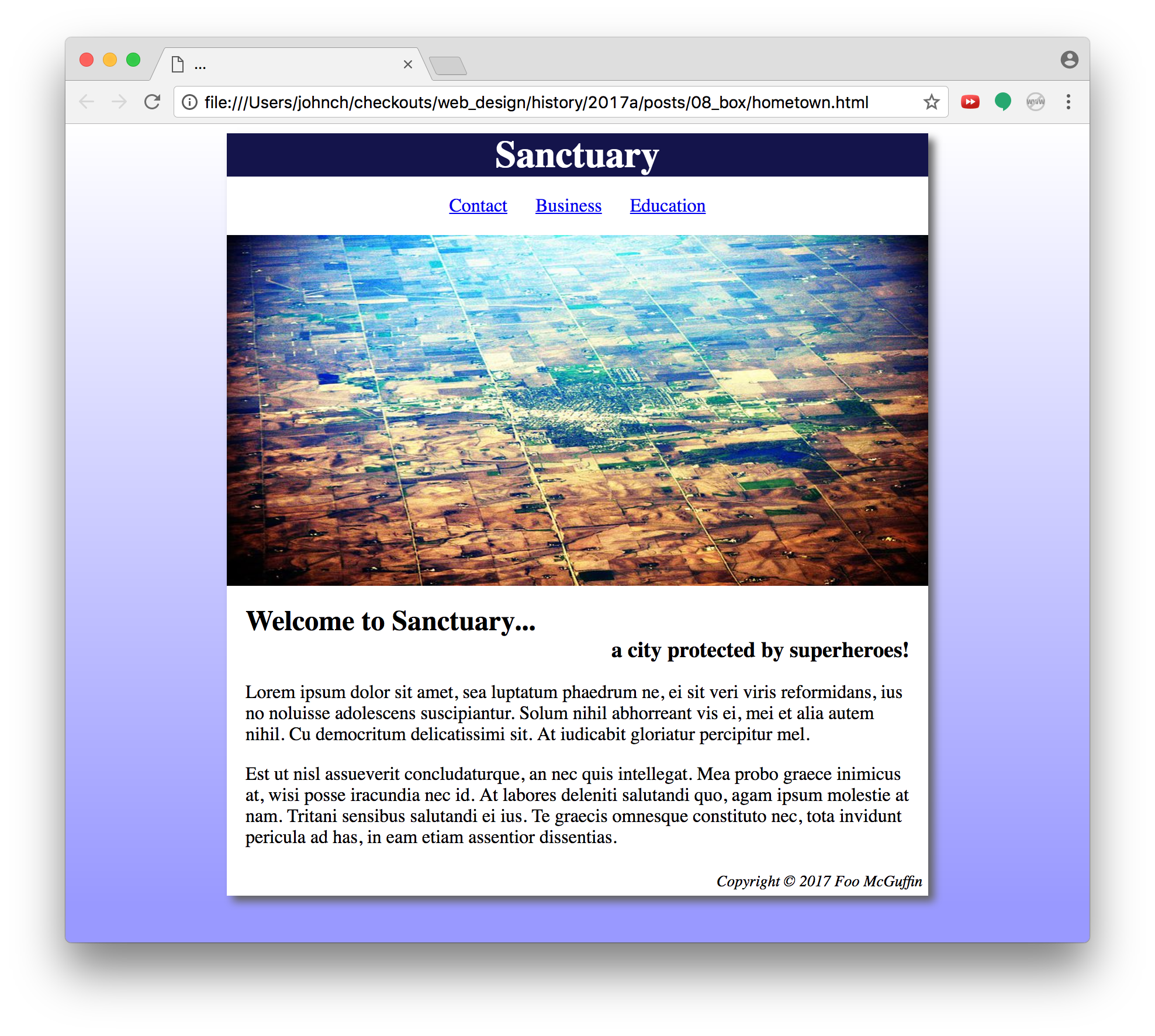
Hometown
Create a webpage that welcomes visitors to a city. Pick your own content and colors, but match the layout and general style of this example:

Pay particular attention to the spacing. Use a box with a fixed size to hold all the content. That means it shouldn’t shrink or grow when you resize the window.
Also, use the semantic elements that we discussed a few weeks ago: header, nav, main, and footer. Recall that these elements are used by screen readers to understand the structure of a page.
Also also, use an img element for the main graphic. In the last lab, we used the CSS background-image element to achieve certain layering effects. We don’t need those here, and img is more appropriate.
Also x3, the inset shadow on the example image is in the original. You can emulate it if you want with box-shadow.
Publish and Validate
Commit and push your work. Verify that all pages have been uploaded by visiting https://USERNAME.github.io/cs318/lab08 in your browser.
Validate your pages with the W3C CSS Validator. Paste in the URLs to your pages, one at a time, and address all concerns raised by the validator. Fix your changes on the local machine, commit, and push until the validator reports no errors or warnings.