Font Diner Workshop
Three years ago I was standing in the pickup line at school waiting to collect my children. I recognized the guy next to me as the father of a kid that my son was partnering with on a project, so I struck up a conversation. I try very hard to avoid the “What do you do?” question, which assumes gainful employment. I don’t want stay-at-home dads, people down on their luck, or leeches living off their parent’s money to feel disenfranchised, so instead I ask, “What’s your station in life?” This guy’s station was that he designed fonts for a company named Font Diner.
We talked about the intersection between our two worlds. I had met Palatino in 5th grade while I was writing my first “novel” and casually fallen in love with type. I dealt with curves and splines regularly in my computer graphics work. But I really didn’t know how fonts worked. He said that he was looking at holding a font design workshop for graphic designers on my campus and invited me to join. Sadly, the date didn’t work out.
Fast forward three years to two weeks ago. It was Wednesday. I saw the guy again for the first time in over a year. He said that he was leading a workshop that very weekend in eastern Wisconsin and invited me to attend. On such short notice, I had to decline. I have large family, and I can’t just abandon them without advance warning. But when I got home I realized that my 11-year-old son might want to attend with me. He did want to, and my wife gave her blessing. So, two days later, I pulled my son out of school early— which I never do—and we drove 3.5 hours to Two Rivers, Wisconsin.
The workshop was held at the Hamilton Wood Type Museum. At the opening reception, we formed a word using certain letters. We then picked out the letter blocks for our word from trays of wooden type, which we then inked and pressed onto paper.
The Lake Michigan wind blew us back into the museum on Saturday morning. We cracked open Adobe Illustrator and threw into the background of our artboard a digital photo of our pressed word from the day before. Using the letters of this word to gauge sizes and shapes, we built up our alphabet over the course of the day. We started on the kiddy slopes of the straight letterforms, which include H, I, L, T, E, and F. Then we graduated to the diagonals, which include A, V, Y, W, M, N, X, K, and Z. After lunch, we were all feeling full, so we naturally progressed to the rounded letterforms, which include O, C, G, and Q. The day ended with the mutant partially-rounded letterforms, which include D, P, R, B, U, and J.
After a hard day of work at the foundry, my son and I picked up some food from China Wok. His fortune cookie taught him the Mandarin word for “to get a fever.” Mine taught me the Mandarin word for “to catch a cold.” This pairing was awkward given the looming threat of the flu-like COVID-19 virus that would shut down the country a week later.
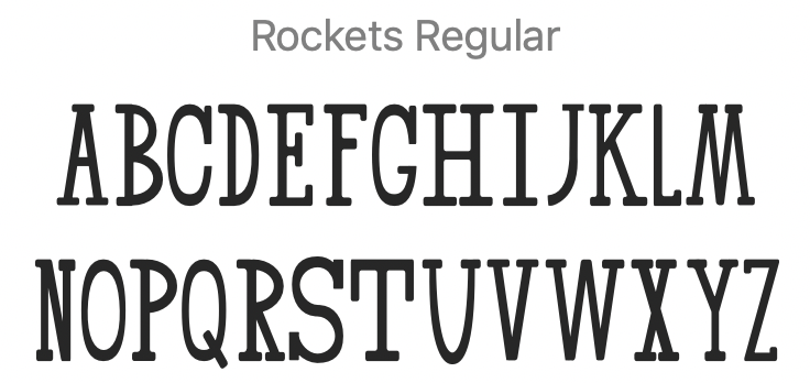
We started Sunday with S. And then our leaders showed us the application Glyphs, which we used to turn our paths into an OpenType font file that we could install. Here’s the poster gothic font that I ended up with:

I am not happy with my rounded letterforms, but I got what I wanted from the workshop: an exposure to the font-making process and some time with my son. He was a steady worker through it all. Our fellow participants, all working adults or graduate students, kept pouring praise on him. I like praise, but not when it takes the form of surprise at how different you are from what people expected of you. My son boldly chose a serif font that first night, and this is what he ended up with:
Thanks, Font Diner, for a one-of-a-type experience.