CS 318 Lab 9 – Box Model, Part 2
Dear students,
Today, we will continue to explore the box model. But let’s add some colorful flavor through gradients. Gradients have some nice properties:
- They eliminate the flatness of solid background colors.
- They automatically scale to fill the background of an element.
- Unlike images, they are generated by the browser. They require no expensive downloads.
Let’s see an example:
#flag {
  background-image: linear-gradient(to bottom, black, red, yellow);
}
Here’s your TODO list for next time:
- Read CSS Position: A Comprehensive Look. Complete all 25 steps of Codecademy’s CSS Positioning module. (Be sure to regularly check your result in fullscreen to see the layout in a normally-sized window. Also, not all the directions seem to produce a sane layout—specifically those regarding the navigation bar. But the interactive exercise still has value.) On a quarter sheet, write down 2 questions or observations inspired by your reading and interacting. Also, provide your own definitions for each of the four possible values of
position.
See you then!

Debate
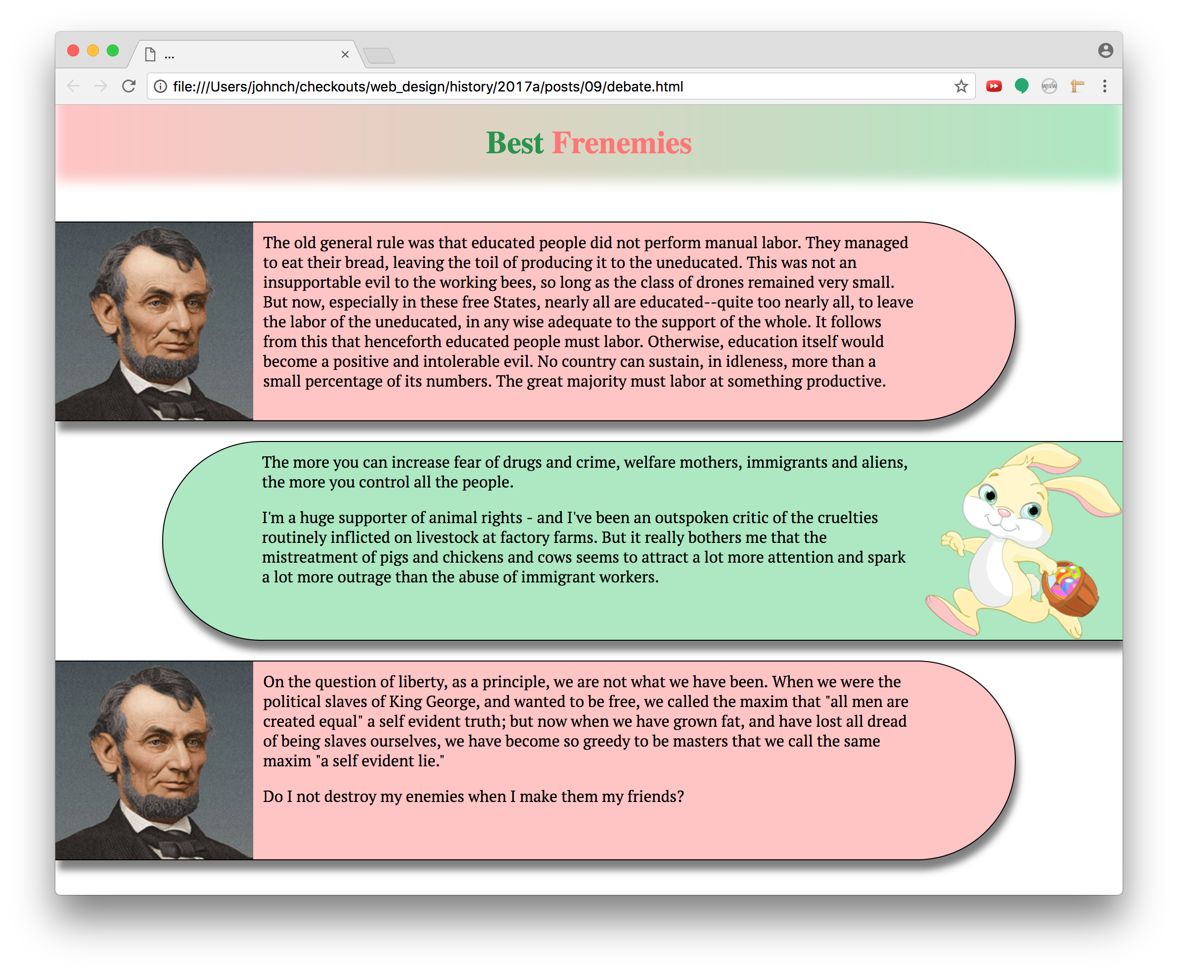
Create a “debate” between two individuals that looks like this:

Here’s your checklist:
- Set the
box-sizingproperty of all elements toborder-box. - Use
divs to create an alternating sequence of blurbs filled with the debaters’ statements. Random text is fine. - Assign each
divto classblurb. Assign the left debater’s blurbs also to classleft. Assign the right debater’s blurbs also to classright. - Have each blurb consume only 90% of the page’s width.
- Color the two sides differently.
- Add a drop shadow to each blurb.
- Push the right blurbs to the right margin by setting its
margin-leftproperty toauto. - Change the blurb font using Google Fonts.
- Add a 1-pixel solid border to all blurbs.
- Set the blurb’s
min-heightto 202 pixels (200 for the content and 2 for the border) andmin-widthto 400 pixels. This will keep the blurbs from getting too small when the window is resized. Test this out to see its effect. - Find two face images, one facing right and the other facing left.
- Set the background image of the left blurbs to a picture of the right-facing speaker. Likewise for the right blurbs, using the left-facing speaker.
- Fix the image’s height by setting the blurb’s
background-sizeto 200 pixels in height. Let the width be automatically calculated. - Adjust the blurb’s
padding-properties to push the text off of the speaker’s image. - Set the blurbs’
border-radiusproperty to give them inner rounded edges. Consult MDN to see how to apply this rounding only to certain corners. - Eliminate the body’s margin so that the blurbs are pushed right up to the browser’s window.
- Set the blurb’s margins so that they are separated from one another.
- Add an overall heading with a gradient that flows between the left and right colors.
- Give the heading two words of content, the left word in a contrasted shade or tint of the right color, and the right word in a contrasted shade or tint of the left color. The website ColorHexa is a helpful resource for generating shades and tints.
- Fade out the bottom of the heading by using an inset box shadow. See MDN’s documentation on the
box-shadowproperty. - Adjust the padding and margin of the heading to pin it to the browser window and keep the text from feeling cramped.
Hometown
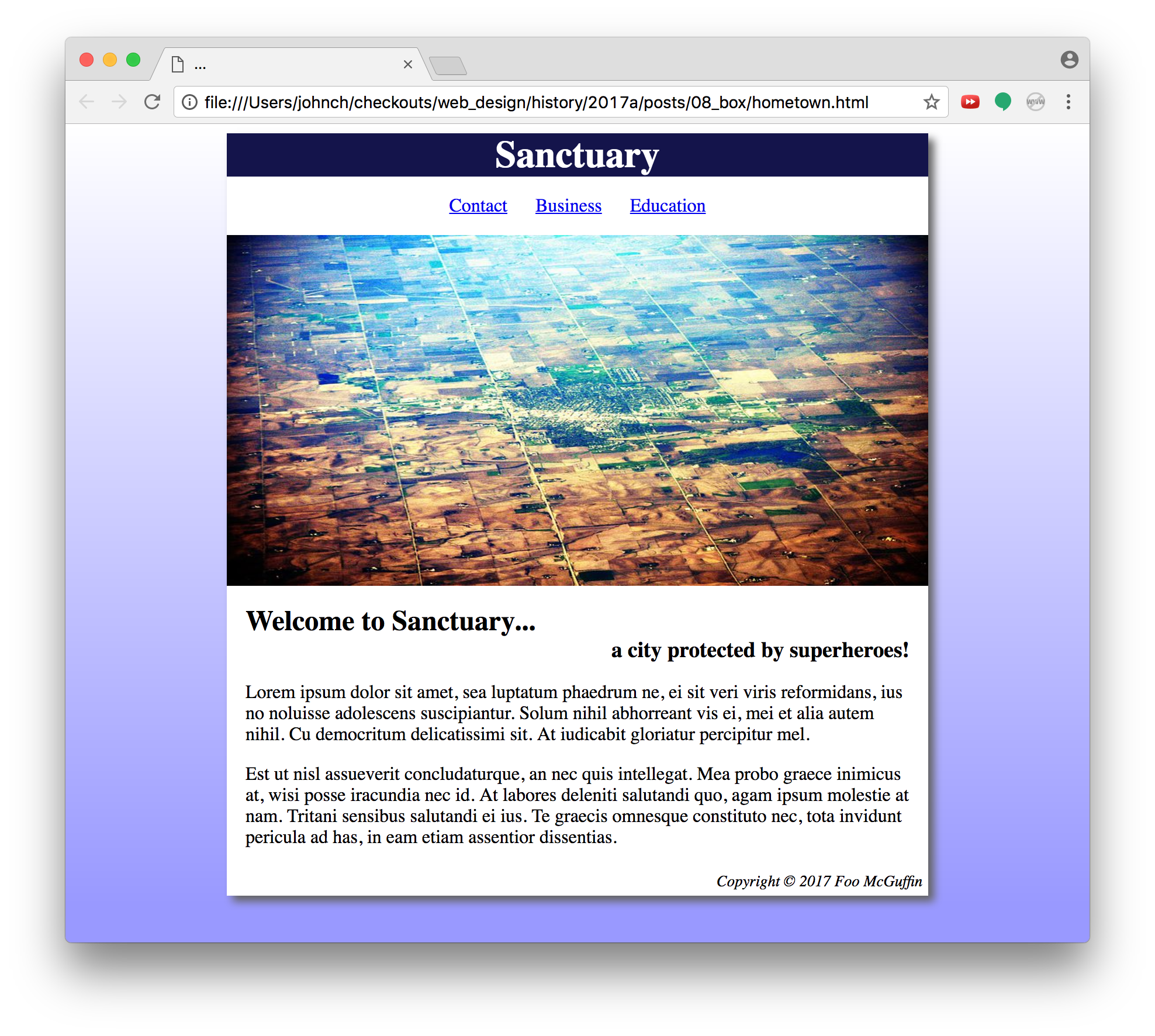
Create a webpage that welcomes visitors to a city. Pick your own content and colors, but match the layout and general style of this example:

Pay particular attention to the spacing.
Also, use the semantic elements that we discussed a few weeks ago: header, nav, main, and footer. Recall that these elements are used by screen readers to understand the structure of a page.
Also also, since we’re not doing any layering or other layout tricks with the image, it should be a plain old img element, not a background image for some div.
Also x3, the shadow on the example image is in the original. You can emulate it if you want with box-shadow.