CS 318: Lab 6 – Divs, Spans, IDs, and Classes
Dear students,
Last time we dropped into the world of CSS as a means of applying style to our information hierarchies. Learning CSS is a little like learning how to conjure springtime. You suddenly have the power to make things bloom and look beautiful. But it will take a lot of practice. This class spins around you practicing with your instructors around, so please do ask questions to help deepen your understanding.
I want to introduce three big ideas before we dive in to the lab exercises. We will mark up some information about the presidents:
Barack Obama
2009-2017

George W. Bush
2001-2009

Bill Clinton
1993-2001

George H. W. Bush
1989-1993

Ronald Reagan
1981-1989

Jimmy Carter
1977-1981
The first idea is a reminder that HTML’s visual elements fall into two basic categories: block elements and phrase elements. You’ve seen some block elements already: h1, ul, ol, and p. Blocks elements appear on their own line. Phrase elements appear inline. You’ve seen some of these: a, img, strong, em. You’ll encounter this block vs. phrase dichotomy a lot, and one of the exercises below shows you a way to make a block element become an inline element.
The second idea is that we can create new generic elements to group together our information any time we want. We say they are non-semantic or semantically neutral, meaning that the browser and screen readers don’t think they have any particular meaning apart from their power to be a container of information. In fact, we often use them to simply chunk up a web page.
We can create a generic block element using div:
<div>
Name: Barack Obama<br>
Terms: 2
</div>
When you see a div, you don’t really know what’s in it, unlike a p or an h1. However, we do know that it’s a block element—at least, by default.
We create semantically-neutral phrase elements using span:
<div>
Name: <span>Barack Obama</span><br>
Email: <span>2</span>
</div>
Some websites use only div and span to structure their entire page, eschewing p, h1, and so on. Simplicity is beautiful, but there are costs to this practice.
The third idea is the notion of labeling elements on a finer grained scale than element name. Suppose we don’t want to style all p elements the same way. Perhaps the first paragraph should appear a little bigger than the others. We can mark up our element and give it a unique label using the id attribute:
<p id="lead">
...
</p>
And then in the CSS, we create a rule for just this ID:
#lead {
  font-size: 120%;
}
An ID gives an element a unique label. No other element should have that same ID—though this is not enforced.
Suppose instead we want to create our own category of elements. For that, we can use the class attribute.
<div class="twotermer">
  Name: <span class="democrat">Barack Obama</span><br>
  ...
</div>

<div class="onetermer">
...
</div>

<div class="twotermer">
...
</div>
In the CSS, we can apply a style to that category of elements like so:
.twotermer {
  font-size: 120%;
}

.democrat {
  color: blue;
}
Those are the big ideas: blocks vs. phrase elements, div and span as semantically neutral containers, and labeling elements with IDs and classes.
Here’s your TODO list for next time:
- Part of your grade in this course is customizing a WordPress blog. Each month we’ll have certain goals. This month you will familiarize yourself with the WordPress editor and make a few posts. See the February goals homework for more details. On March 1, I will scan through your blog and award Blugolds accordingly.
- Investigate four CSS properties on MDN. Summarize their effect on a quarter sheet.

Lab
We have a few goals for today’s lab:
- Use
divs to create “chunks” of information. - Continue practicing with adding style via CSS.
- Use
classandidattributes to gain more control of what elements we style.
Your task is to create several independent pages with no overarching story.
Partners
Create a lab06 directory in your cs318 project. In file partners.html, provide your names.
Two by Two
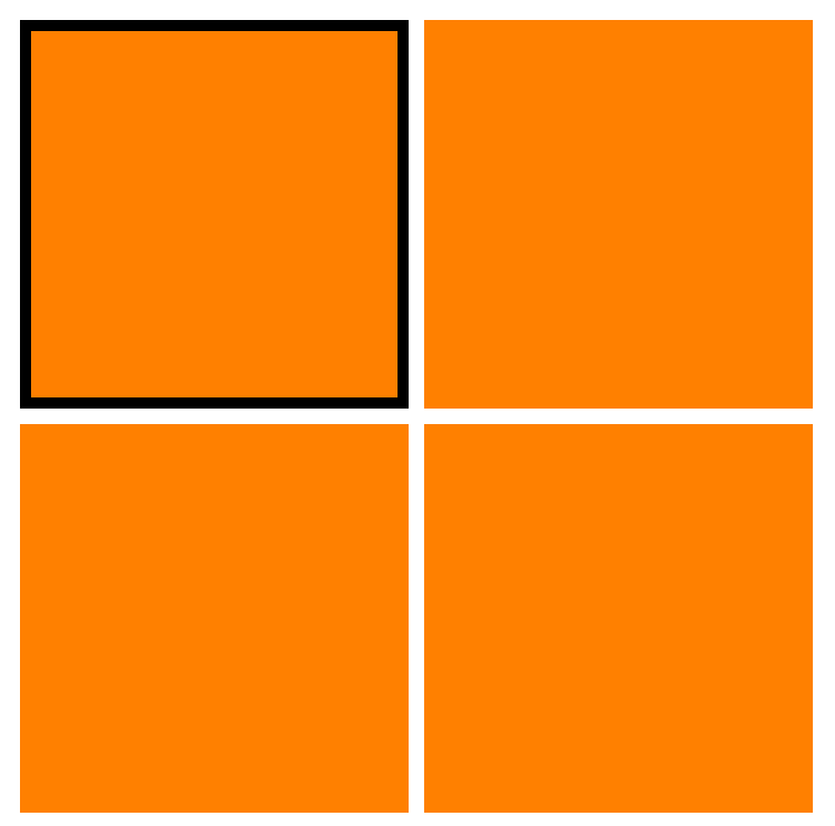
Create a 2×2 grid of squares that shows a border around the square that has been most recently clicked on. For example, in this rendering, the top-left square was most recently selected:

Achieve this by doing the following:
- In
twobytwo.html, create a sequence of fourdivs, each with classsquare. Include an external stylesheettwobytwo.css, in which you give everysquarea width of100px, a height of100px, and a background color of your choosing. - Rearrange the four squares into a 2×2 grid. A
divis a proud block element, so its succeeding element will appear on the line below it. To allow twodivs to appear in the same line, givesquare‘sdisplayproperty the valueinline-block. What do you need to do to split the line into two rows? - Make the top-left
divlink a to file namedtopleft.html. Do likewise for the otherdivs, but use each corner’s name. All told, you have should foura–divcombos linking totopleft.html,topright.html,bottomleft.html, andbottomright.html. - Copy
twobytwo.htmlfour times to the four files you’ve linked to in the previous step. Yes, they all have the same content, and this should feel silly. - In
topleft.html, give the top left square an ID ofhighlighted. Intopright.html, give the top right square thehighlightedID. And so on in the other two files. - In
twobytwo.css, which is shared by all five HTML files, give thehighlightedelement a border using these three properties:border-width,border-style, andborder-color.
There are better ways to accomplish this sort of selection, ways that require only a single HTML page and eliminate the redundancy. But these ways are the subject of CS 319.
Bulbapedia
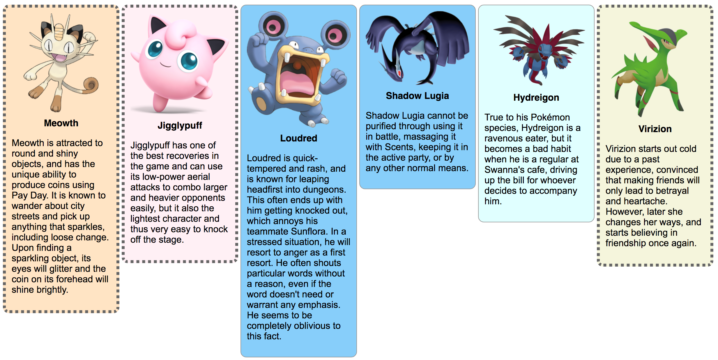
Create a mini Bulbapedia showing 6 characters from Pokemon in a page that looks like this:

I don’t know much about Pokemon, even though it first came out when I was a kid. I’m just trying to feel young and hip to earn your respect.
Speaking of respect, let’s respect these steps to get our mini Bulbapedia up and running:
- Create two files:
pokemon.htmlandpokemon.css. Add the boilerplate, the mindless text that is present in every HTML file. - Find any six characters from Bulbapedia whose images have a transparent background. The transparent background is important, as we will be adding in our own background color. For the time being, paste their URLs in a handy little HTML comment:
<!--
Text inside a comment doesn't render. We can leave ourselves notes!
Like "self, i wuv u."

Here are my Pokemon links:
http://url1
http://url2
http://url3
http://url4
http://url5
http://url6
-->
- Create a
divfor the first card and give it classcardand IDpokemon1. Give the card three child elements in the following sequence:How does the card look? Probably ungainly.- An
img, using your first URL as the image’s source - A
divwith classname. Give as its content the character’s name. - A
pelement with a blurb about the character borrowed from the Bulbapedia profile.
- An
- In CSS, set the width of class
cardto200px, have it display as aninline-block, and give it a mute border using theborder-style,border-color, andborder-widthproperties. Rounds its corners by setting theborder-radiusproperty. - How does the image look? It probably busts out of the div. Fix that in CSS by adding a block for only images that are child elements of a
card:Recall from your reading that this is called a descendent selector. These are very useful for narrowing the portion of your information hierarchy to which you apply a style. Set its.card img { }
widthto be100%of the space allotted to it by its parent card. - Style class
nameso that the text is bold, centered, and uses a sans-serif font. Use thetext-align,font-weight, andfont-familyproperties. - Style
pelements within acardto use a sans-serif font. - Style
pokemon1so that its background color complements the character. - Once you’re satisfied with your first card, copy and paste its HTML to make five more cards, customizing the URLs and blurbs accordingly. Update the IDs so that you have
pokemon1,pokemon2, all the way throughpokemon6. Add rules to your CSS to give an appropriate and unique background color to each card. - You may find the six cards to be staggered vertically. Set
card‘svertical-alignproperty totopto push them all up against the top margin. The default value isbaseline, which lines them up with the bottom of any neighboring text. - Choose three of your favorite cards and give them a second class:
favorite. An element can belong to many classes, but it must have only one ID. For example, we can say that a paragraph is a member of bothunimportantandfunnylike so:<p id="joke19" class="unimportant funny"> ... </p>
- Style
favoriteso that it has a more prominent border. Use theborder-style,border-width, andborder-colorproperties.
FAQ
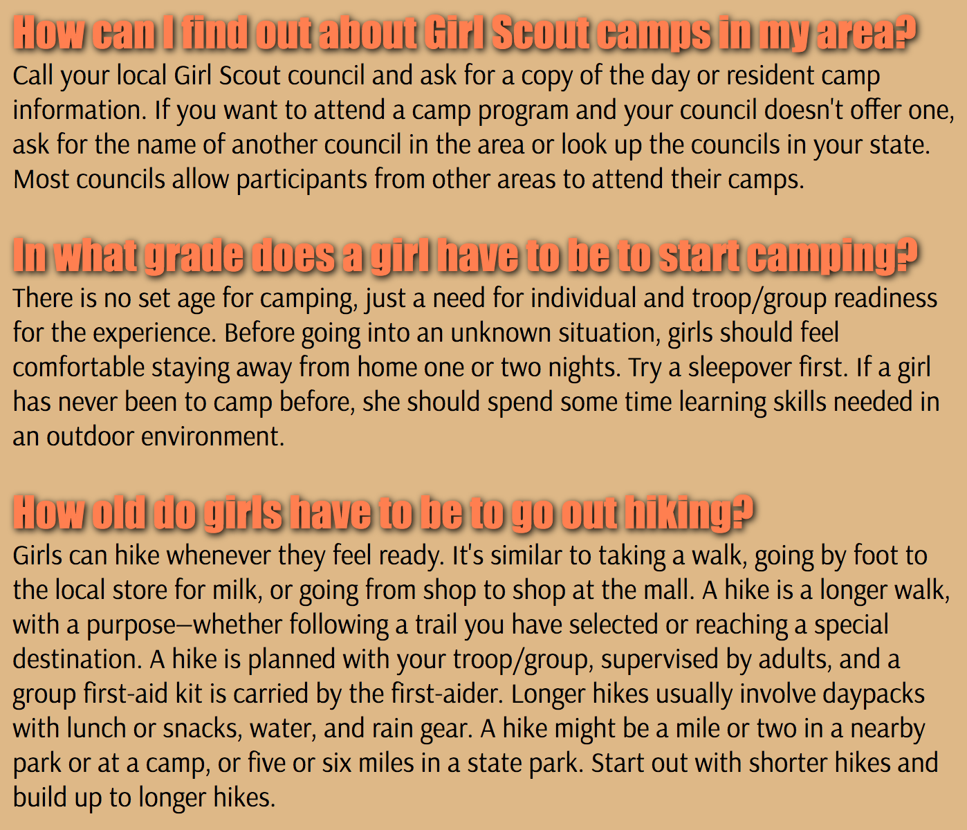
Create a stylized frequently asked questions (FAQ) page like this one, whose questions and answers are courtesy of the Girls Scouts:

We’ll also apply some fonts to fancy things up.
Achieve this by doing the following:
- Create two files:
faq.htmlandfaq.css. Add the boilerplate. - Locate a FAQ through an internet search, and copy and paste some its text into your HTML file. Include at least three question-answer pairs. Make each question an
h3element. Make each answer apelement of classanswer. - Set the
body‘s background color so that it complements your subject matter. - Style the
h3s to have afont-sizeof24ptand an appropriate color. - Visit Google Fonts and identify a strong and thick heading font. Click the plus icon to select it and then expand the selected dialog at the bottom of the window. Copy the
linktag and paste it next to your ownlinktag infaq.html. This will make the font available in your web page. - Paste the
font-familysetting in your rule forh3. Did the font change? It should have. - Add a
text-shadowsetting toh3. This property expects four values:text-shadow: x-offset y-offset blur-radius color. To lean a black shadow right more than down and give a subtle blur, you’d write:text-shadow: 4px 1px 5px #000000. Use values that you think look good. - Pick a second font in Google Fonts for the answer text. Copy the new
linktag from the selected dialog and paste it over your old one. You should see that this one loads both your fonts. Set thefont-familyof theanswerclass to use this second font.
Publish and Validate
Commit and push your work. Verify that all pages have been uploaded by visiting https://USERNAME.github.io/cs318/lab06 in your browser.
Validate your pages with the W3C CSS Validator. Note that this validator looks similar to the one we’ve been using, but it is different. This one checks CSS; the other did not. Paste in the URLs to your pages, one at a time, and address all concerns raised by the validator. Fix your changes on the local machine, commit, and push until the validator reports no errors or warnings.