CS 318: Lab 12 – Two-column Layouts
Dear students,
Today we visit the canonical two-column layout. We’ll use the float property to allow other content to flow around it. We’ll do a quick example together of adding illuminated letters to a page.
Suppose we have this paragraph:
<p>A writer—and, I believe, generally all persons—must think that whatever happens to him or her is a resource. All things have been given to us for a purpose, and an artist must feel this more intensely. All that happens to us, including our humiliations, our misfortunes, our embarrassments, all is given to us as raw material, as clay, so that we may shape our art.</p>
First, let’s bump up the font size and impose some wrapping:
body {
  width: 400px;
  font-size: 18pt;
}
Second, let’s set apart the initial letter A by putting it an illuminated letter in its place:
<p><img src="https://path/to/some/a.png" class="illuminated" alt="A">writer—and, I believe, generally all persons—must think that whatever happens to him or her is a resource. All things have been given to us for a purpose, and an artist must feel this more intensely. All that happens to us, including our humiliations, our misfortunes, our embarrassments, all is given to us as raw material, as clay, so that we may shape our art.</p>
But there’s no flowing of content around our really big letter. Let’s add some floating and tweak the padding to make it look aesthetically balanced:
img.illuminated {
  float: left;
  padding-right: 5px;
}
That’s what floats do for us! However, we don’t always want content to flow. Suppose we have a few more paragraphs of text:
<p><img src="https://path/to/some/a.png">rt is a lie that makes us realize truth.</p>
<p><img src="https://path/to/some/a.png">ll our discontents about what we want appeared to me to spring from the want of thankfulness for what we have.</p>
These quotations bleed into each other, which isn’t appropriate. What can we do? We clear any previous floats:
p {
  clear: both;
}
And there we have it. Here’s your TODO list for next time:
- Browse Opportunity for All? Technology and Learning in Lower-income Families, a report by the Joan Ganz Cooney Center—the same folks that brought us Sesame Street.
- Read chapter 8 in your book.
- On a quarter sheet, share 2-3 questions or observations from your readings. Consider commenting on the role of responsive design in a society with considerable socioeconomic stratification.
See you then!

Lab
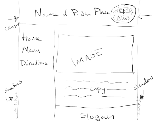
Your task in this lab is to make a website for a pizza place. It consists of three pages: a home page, a menu, and an embedded map. All will share the same general layout, with only the content in the main element changing.
First create a lab12 directory. Add a partners.html and include your first names and last initials.
Home
In home.html and pizza.css, create a page that looks like this:

Complete this checklist:
- Use
header,nav,main, andfooterto structure your page, with each element tightly interlocking with its neighbors. Give each a background color in a warm color theme. Pizza begs for warm. Considering finding a theme on Adobe Color CC or a similar service. - Fix the width of the body to 600 pixels and center it within the window. Add a subtle shadow to both sides. Use 0 for the offsets and non-0 for the blur radius.
- Arrange the page such that the
navelement floats left andmain‘s left margin is inset by the width ofnav. - Ensure that each box is adequately padded. No text should be jammed up against an edge of its container.
- Provide links to
home.html,menu.html, anddirections.htmlin thenavelement. - Use a
ulfor the navigation links. Remove the bullets and underlines. Consult MDN for a description of thelist-styleCSS property. - Use background colors to make it appear that the left column stretches all the way down to the footer, though in reality the
navwill be much shorter than the main content and footer. - Add a
divwith anidoforder. Give it fixed positioning and a background image of a pizza. Make sure the pizza image itself has a transparent background. (Perhaps this one?) Adjust the width and height of thedivand background image to consume just a small portion of the page. Make this pizza always appear in one of the corners of the browser window, even if the viewer has scrolled down. Test this by adding dummy text to fill up your page and shrinking your browser window so the scrollbars appear. - On the top of this pizza put a link with the label
ORDER NOW!. Color and shadow it to make it readable. - Horizontally and vertically center the
ORDER NOW!text on the pizza. Vertical centering is a major pain in CSS. Here’s one way to do it. Embed the text within adiv, this one withabsolutepositioning. Anchor it against the center of its parent by settingleftandtopto 50%. This will put the upper left corner of the text at the center. Center it by addingtransform: translate(-50%, -50%)to shift it back left and up by half of its own dimensions.
Menu
Switch partners.
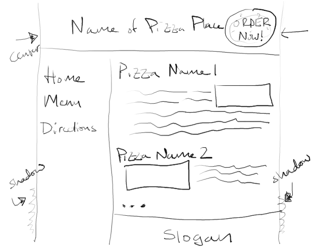
In menu.html, add a menu whose text flows around images of the various pizzas that can be ordered at your restaurant. Continue to put CSS in pizza.css. (Sharing styles between pages is one of the advantages of external stylesheets.) Match this general layout:

Complete this checklist:
- Use the same overall structure as you did in
home.html, but inmainlist at least three types of pizza, each with at least three elements: a heading identifying the name of the pizza, a paragraph of text describing the pizza, and an image showing the pizza. - Embed the image within the paragraph of text. As you advance through pizza types, alternate between floating left and floating right.
- Have each pizza paragraph clear any previous floats so the pizza types are clearly separated.
Directions
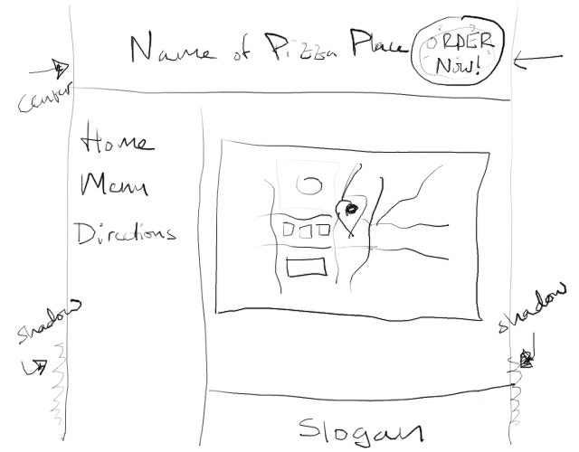
In directions.html, add a map that your viewers can use to locate your business. Match this general layout:

Complete this checklist:
- Provide an embedded map to your business using an
iframe. Find a real business on Google Maps or some other mapping service. Find the Share button, and look for an option to embed a map. Copy out theiframecode and paste into your HTML file.iframes are a means of nesting a completely different website inside your page.
Publish and Validate
Commit and push your work. Verify that all pages have been uploaded by visiting https://USERNAME.github.io/cs318/lab12 in your browser.
Validate your pages with the W3C Validator. Paste in the URLs to your pages, one at a time, and address all concerns raised by the validator. Fix your changes on the local machine, commit, and push until the validator reports no errors or warnings.